
Bukalapak is one of Indonesia's leading online marketplace brands working to provide a platform convenient and accessible for everyone, preeminently the aspiring middle-class, making the experience of buying and selling more exciting and empowering for the users.
We collaborated closely with Bukalapak Design on the new revamped visual identity, which coincides with the strategic shift towards a well-placed positioning as well as a clear vision for the company's future. The brand strategy framework—as resulted through a collective work between Bukalapak and Nation Insights before finally handed over to our team—reflects on a new mission to empower the lives of aspiring middle-class Indonesians, as summed up in the proposition:
Bukalapak gives you the freedom to be more flexible, spontaneous, and to get more out of life.
This new spirit is expressed in the attributes of optimistic light-heartedness and guiding friendliness that runs through the whole development of our brand system.
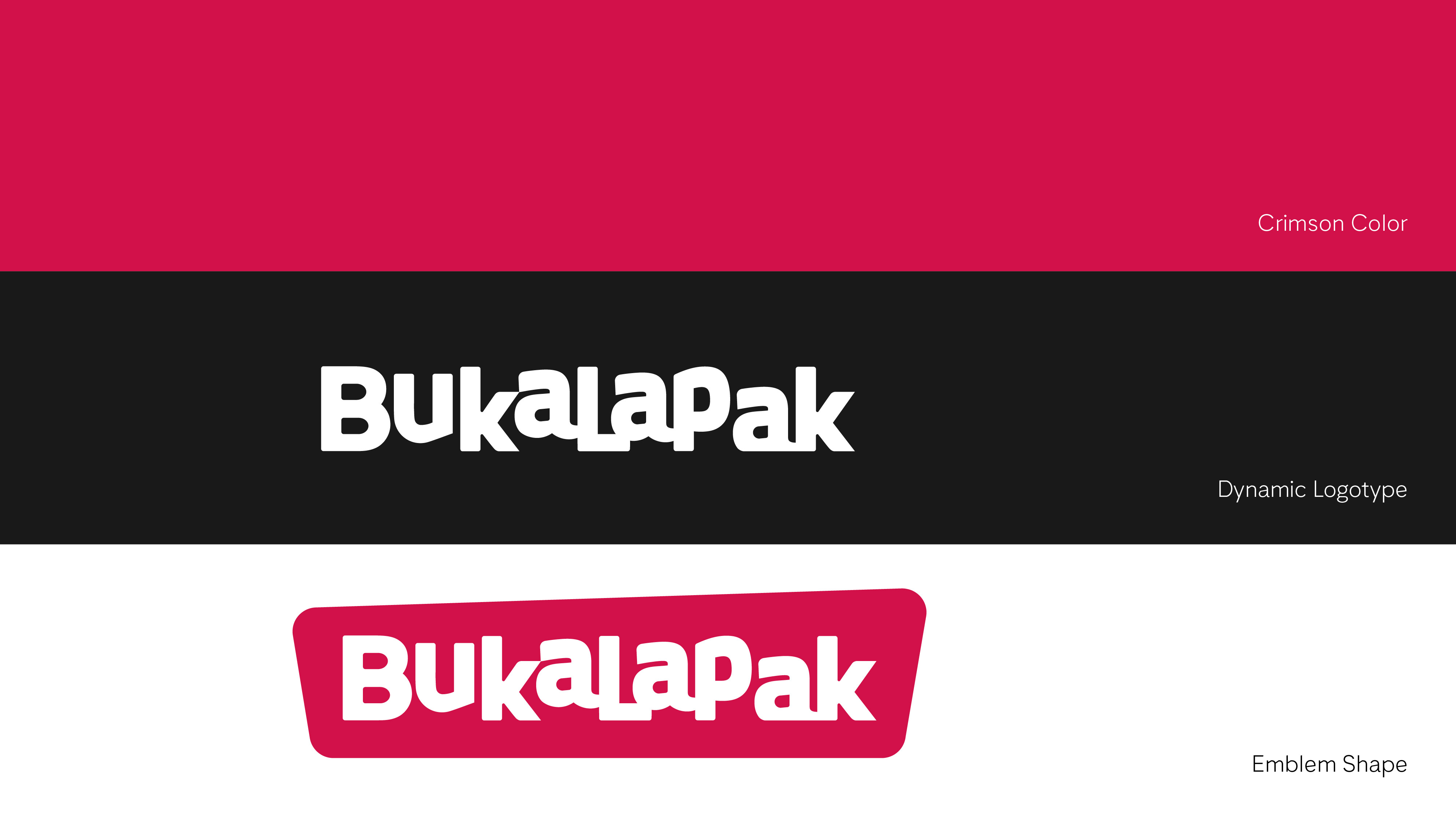
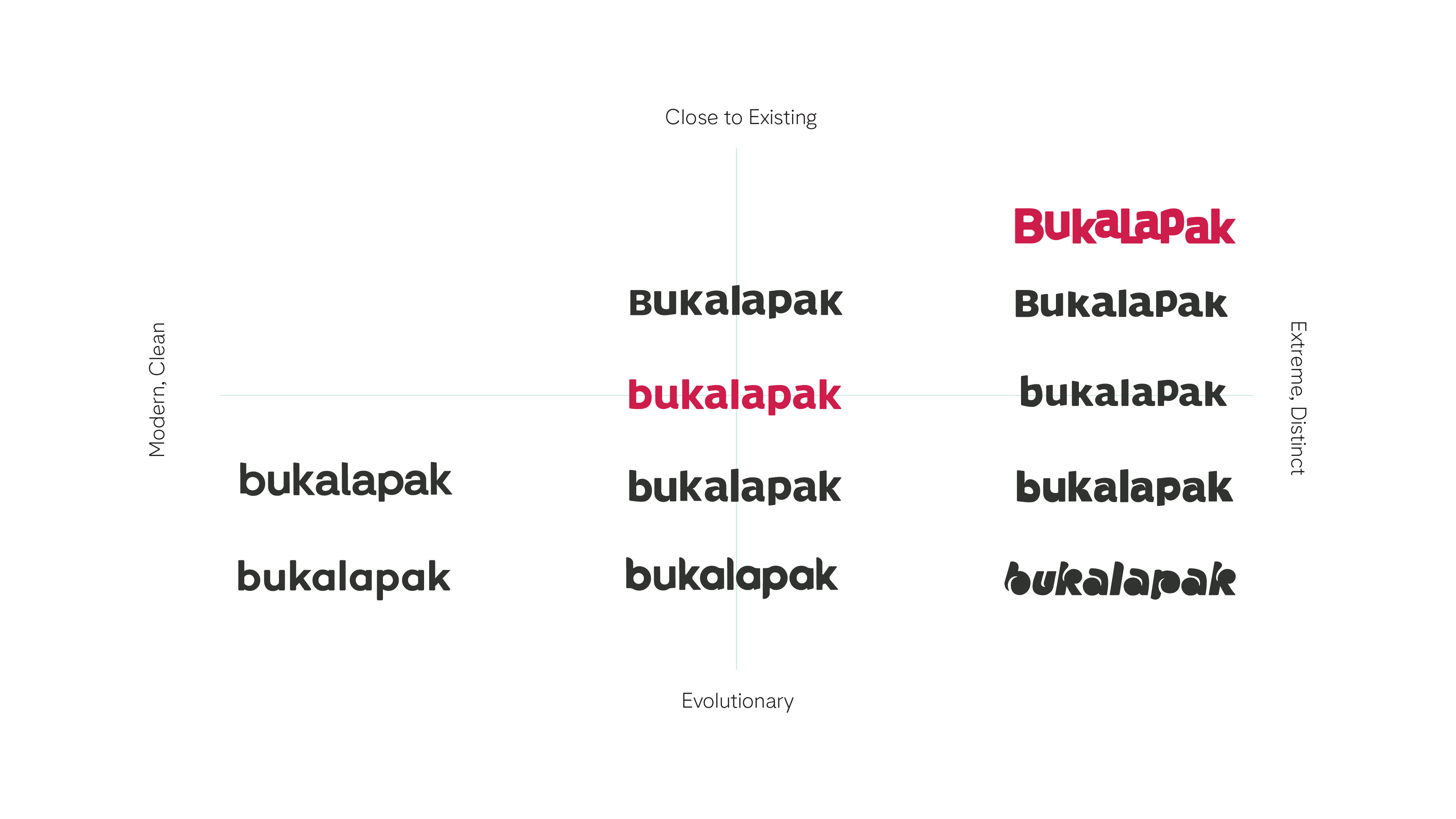
Beginning the process of logo exploration and development was a small internal discussion, intended to analyze the preceding identity of how Bukalapak was mostly identified. The crimson color, dynamic logotype, and emblem shape were the top three that we later used for the variables to scale whether the rebranding direction was to be evolutional or radical. The early explorations focused on presenting a plethora of different directions ranging between those two poles, up to a point where we decided to go for the latter, considering the importance for a tech-based brand to possess a distinctive symbol.
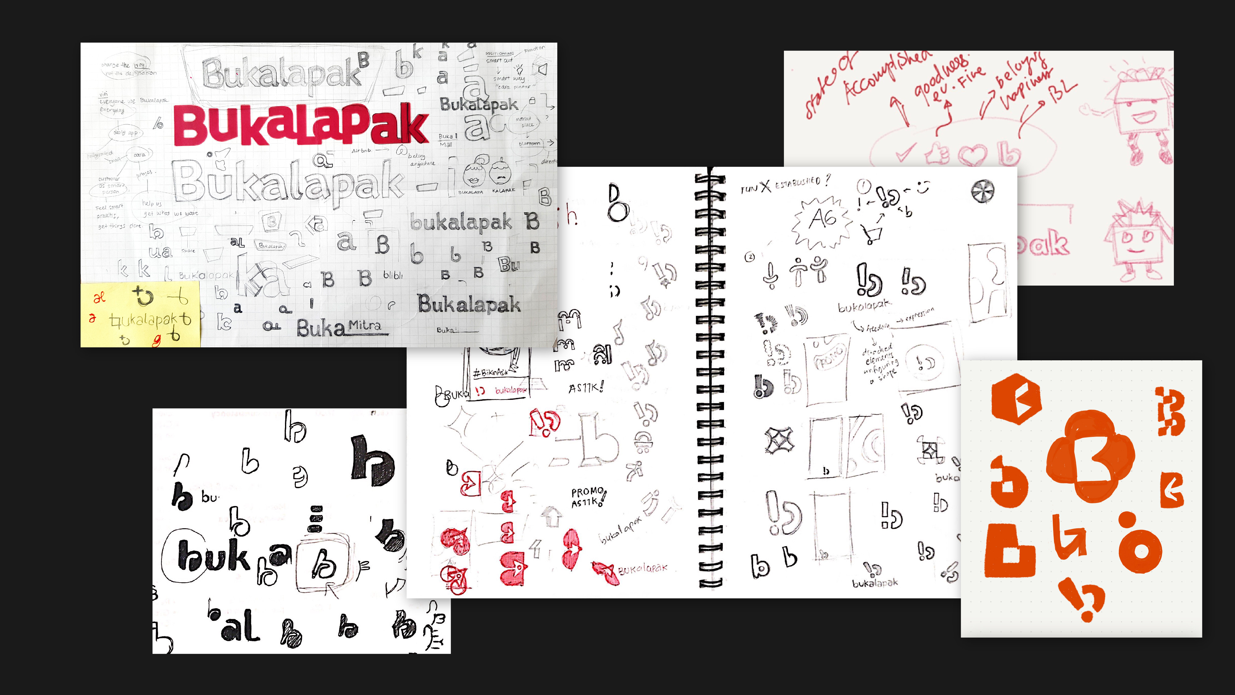
Hundred of marks, if not thousands, were sketched upon various ideas and findings in search of that which could best communicate the company's essence in the simplest and most meaningful way. We worked through a wide range of options and iterations—some closer to the original logo while others went completely different directions, some started with the monogram B while others upon extended stories, of which some cases went somewhat too far-off. But isn't that the point in trying, though?
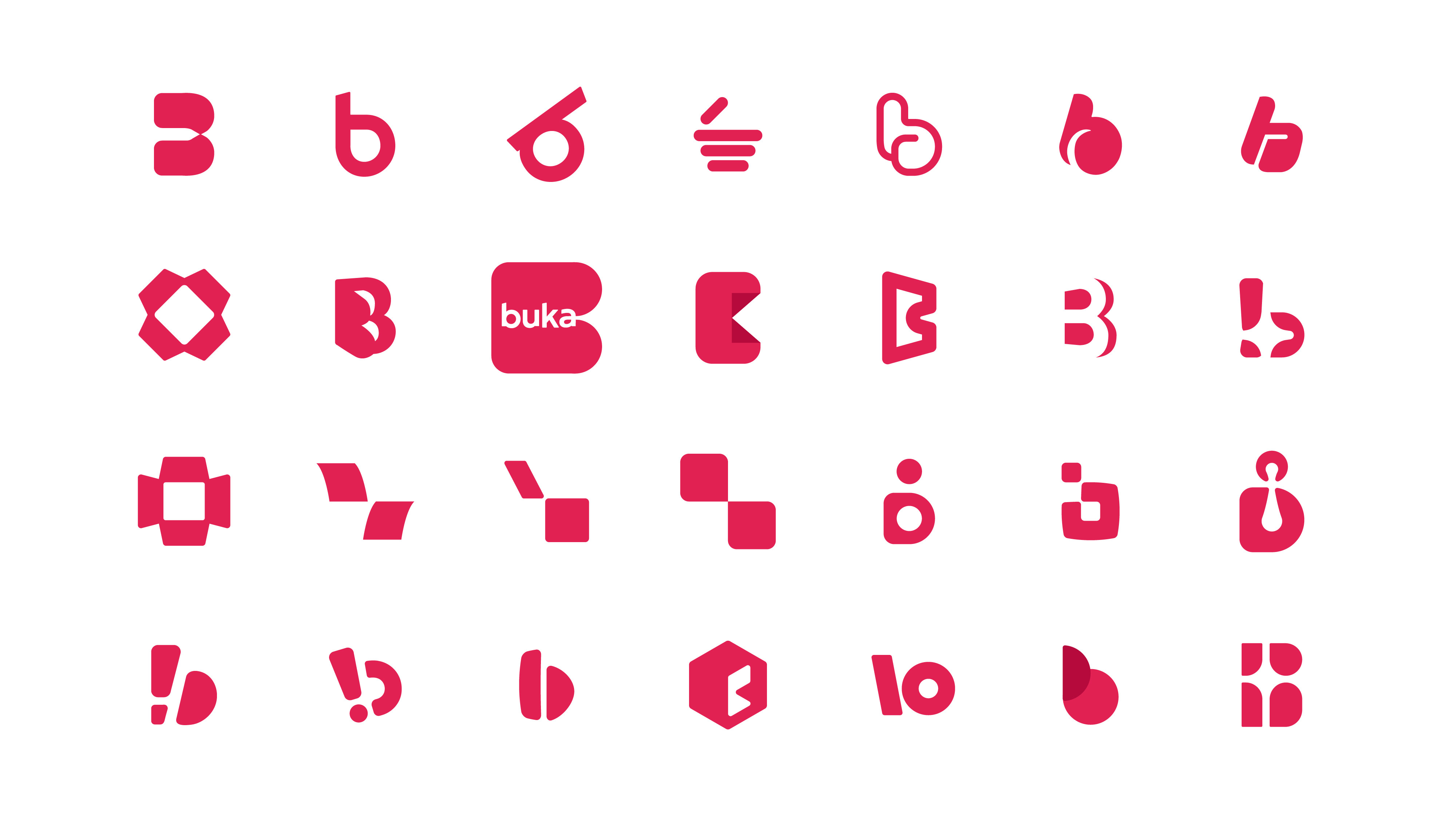
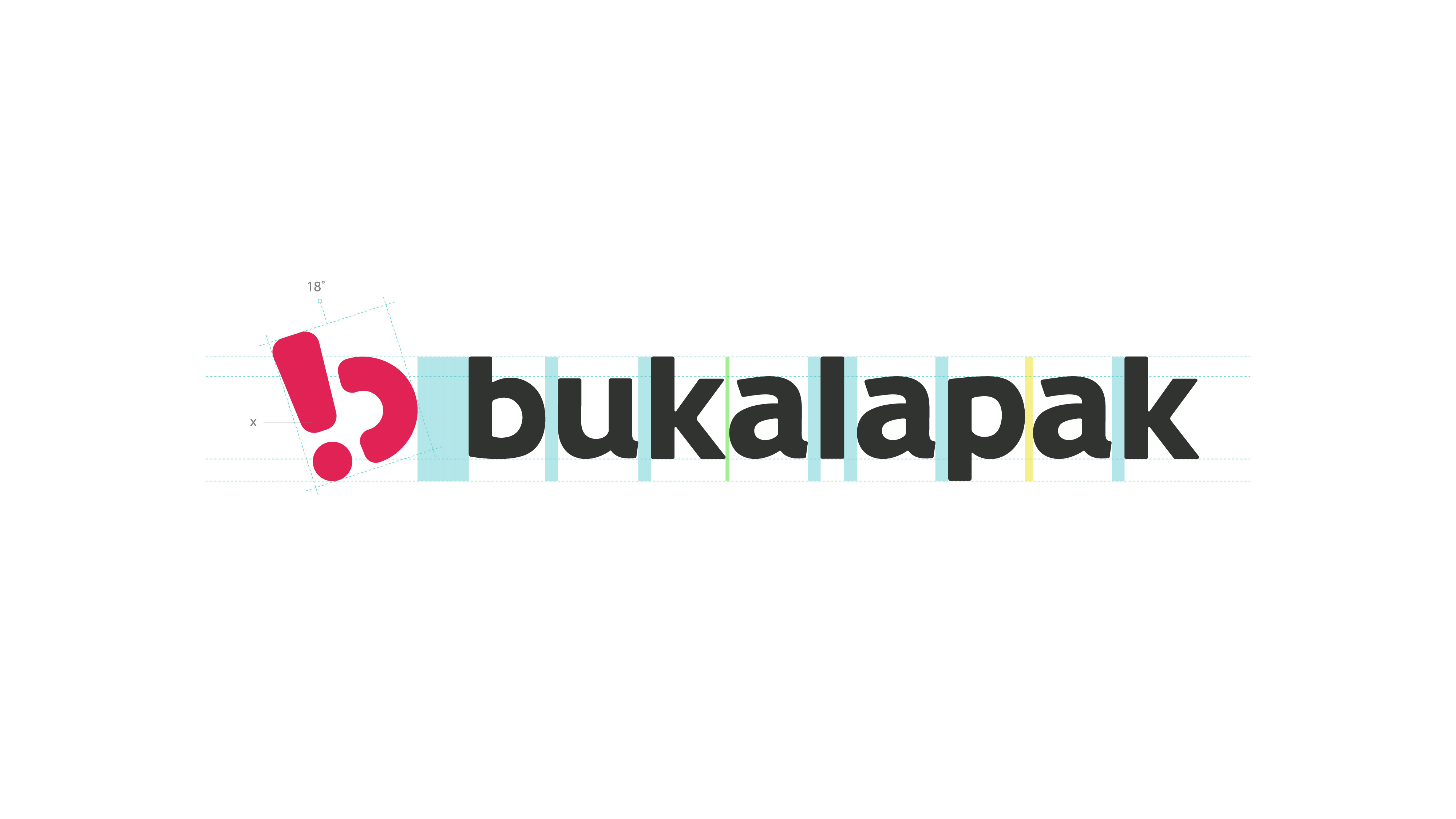
The final version of the logogram was built upon multiple meanings. A distinctive monogram B that also embodies the very essence of fun and empowerment carried in a nature that is straightforward and easy to catch on.
Upon finally finding the symbol, the only aspect that is intentional at first was the exclamation mark, which opens the imagination and birth of a winky smile and empowered figure when furthermore contemplated. The monogram also maintains the diverging form and rounded friendliness that is important as part of the brand's visual language.
For a logo to possess an open-end interpretation can sometimes be questionable for some. But this notion of leaving the probable, plausible, and possible future for a reimagined perception towards a particular shape—of which we reckoned only after public response emerged and put to table their own interpretations of the logo—is somewhat acceptable and if not, should be embraced. It adds to the weight of what makes a brand truly alive in the middle of their audience.
As for the logotype, it went through several alterations to retain the previous logo's characteristic form that carries on the journey of Bukalapak's legendary past. The quirky up and down nature, perhaps intentional, of the original logo was the exact embodiment of Bukalapak's traits as known by the public: eccentrically goofy yet groovy. The design challenge is then to accommodate logo optimization for various platforms and scales without dismissing its very soul. Characters are all set in the baseline level, tails from all vowels are adapted from its predecessor, and 'B' letter set to lowercase. The updated logotype balances out the newly-introduced wordmark to establish familiarity that is refreshing to the senses.
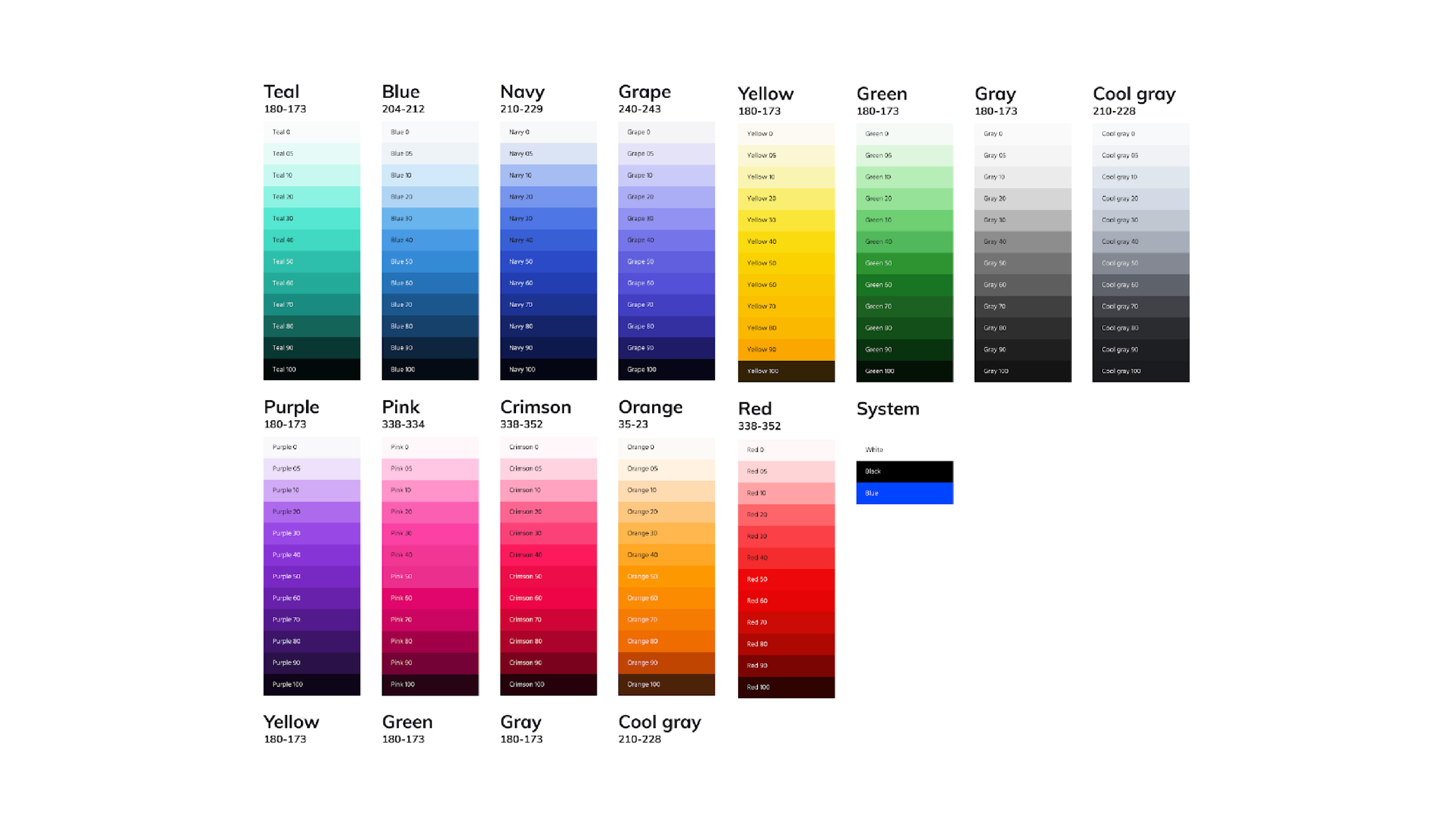
The aforementioned crimson color, although iconically Bukalapak, brought in constraint for the internal team to address an array of different communications and desired tones. Say, an identity for daily promotions would appear in the same crimson as would the key visuals for New Year's or Valentine's. As well as the predicaments of implying celebrations that are strongly associated with a certain color(s).
Essentially, Bukalapak Design has by then developed a complete set of color spectrum specifically for product purposes. But the next question is, what are the colors of Bukalapak? In trying to understand how particular colors could work together and further set apart Bukalapak from the crowds, we performed several color studies and experimentations. Together with Bukalapak Design, we also conducted a working session to which resulted in narrowing down the direction to a palette that comprises dark and light color combination.
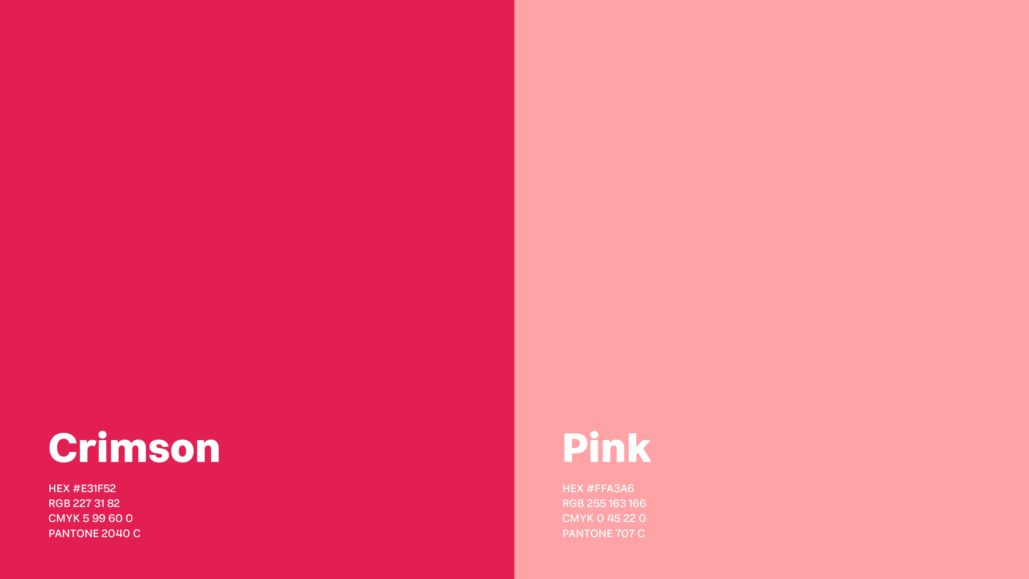
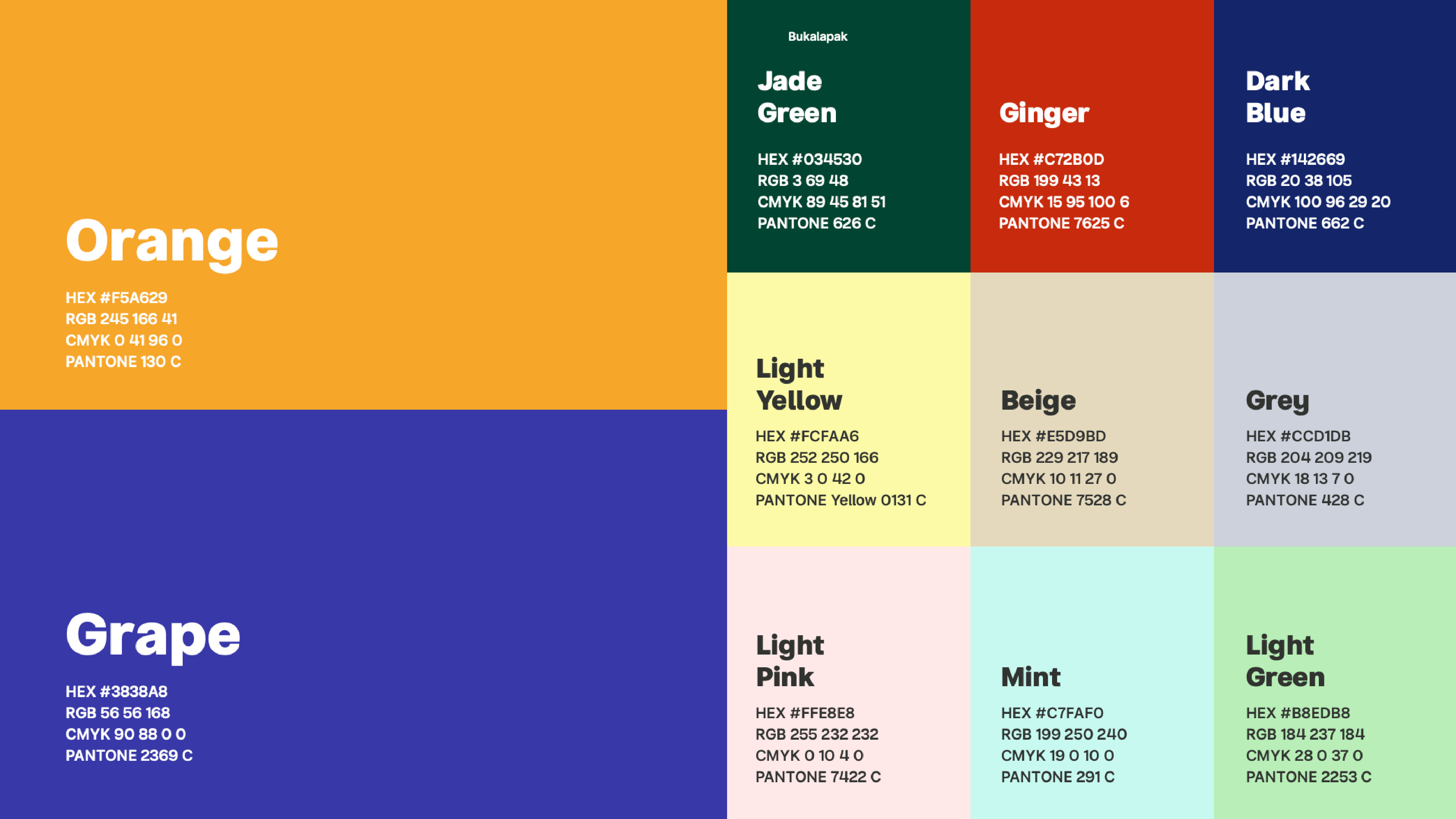
Ultimately, the final color palette features three main categories. We retain the iconic crimson as Bukalapak's primary along with an additional pink, allowing the colors to give a bit of a tone down. The second in line according to the color proportion are the secondary colors used for lesser instruments, followed by the accent colors where the light colors are all nested, providing a harmony for their darker counterparts, if not appearing as a cherry on top.
The rebranding introduces the debut of a custom typeface, Buka Sans, spanning in 10 weights comprised of Display and Text. Designed by Tokotype Studio in close collaboration with Bukalapak's internal team, the development of the typeface balances out the functionality—optimized for Bukalapak's vast product range—and the presence of friendly welcoming expression.
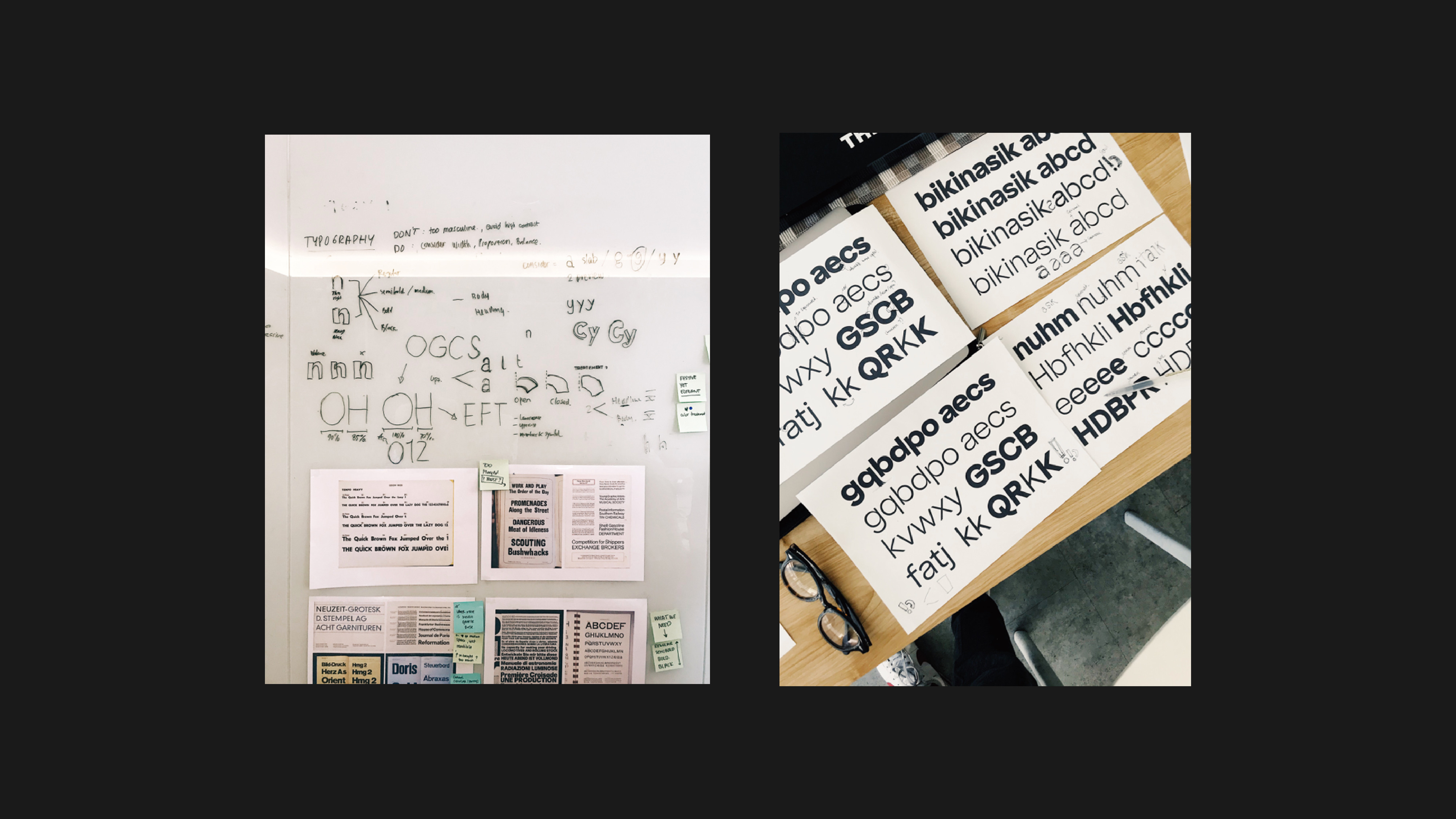
Angled spurs, thinned stems, and closed terminals are among the details of which entitled the typeface as a precise engineering. The wide range of weights accommodate the needs for various products and communications: Light for elegant communications; Regular, Medium, and Bold for casual subheadlines and running texts; Extra Bold and Black for a standout type treatments, all easily scaled without losing its fundamental legibility.
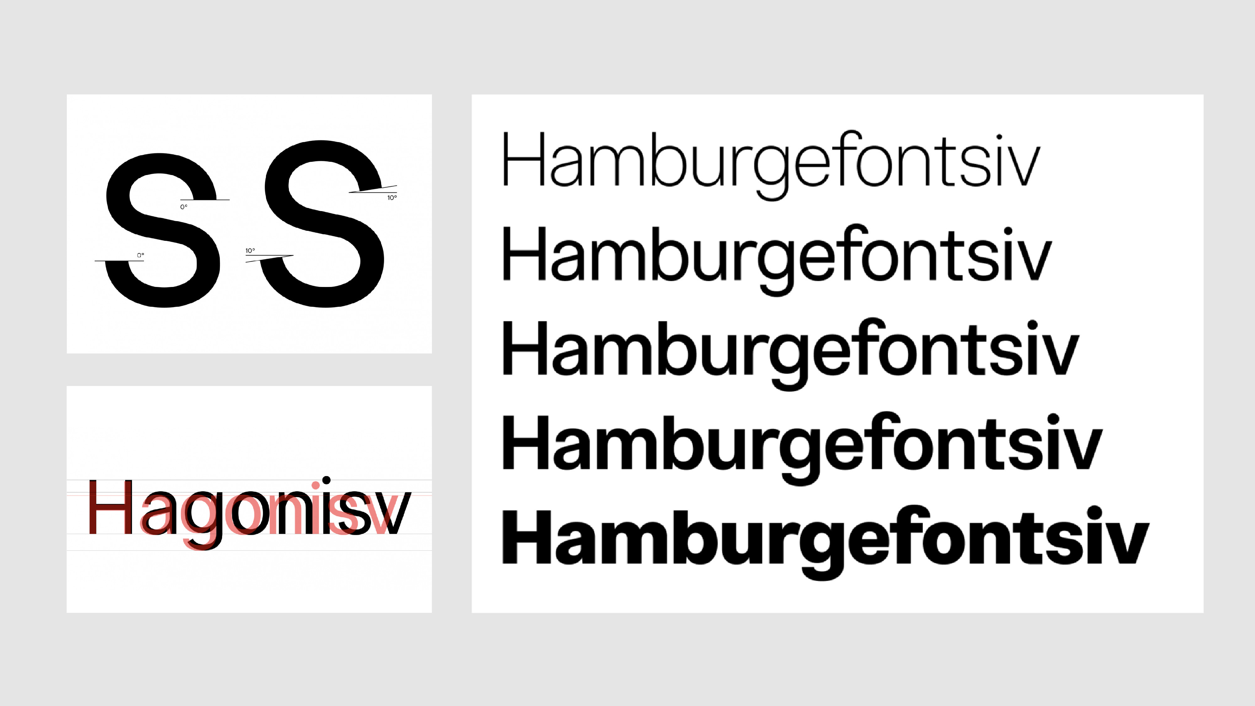
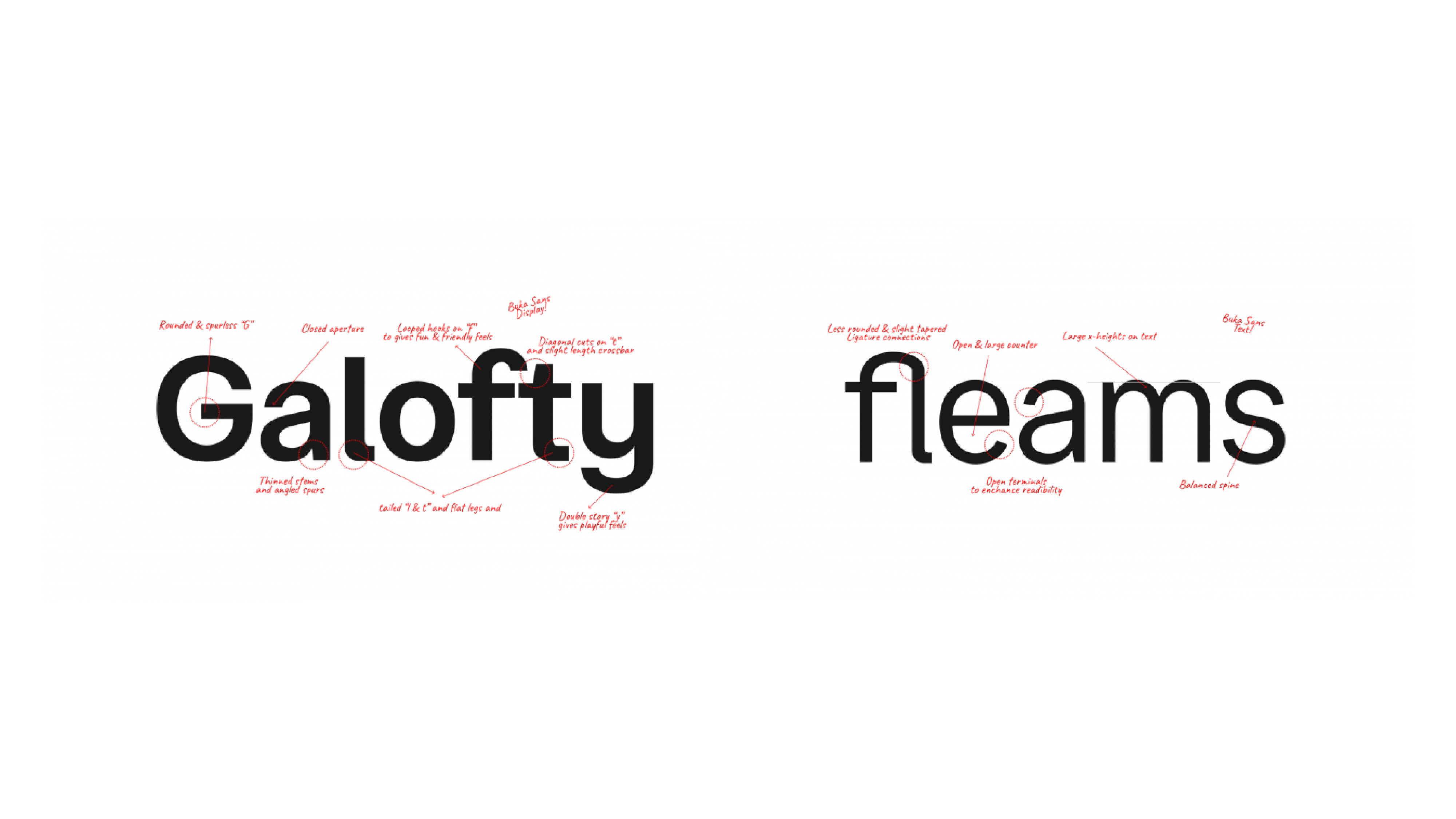
Custom typeface, in this case, allows for Bukalapak to implement a comprehensive system that is well-fitted for small screens use as well as expressive marketing promotional.
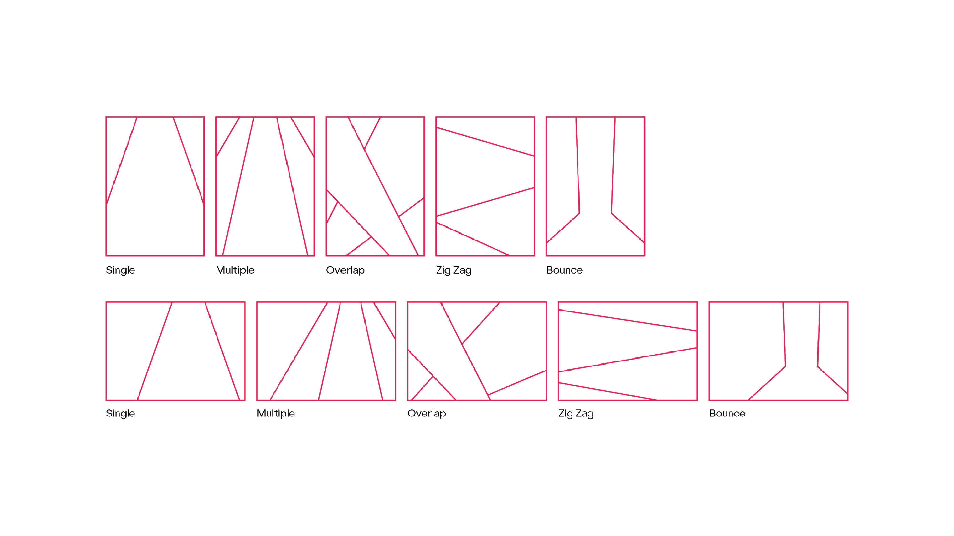
To further extend and bring the spirit of fun and empowerment across all brand expression, we looked back on the identity assets that we have developed so far and found the relevance in a particular object: a spotlight. The idea comes from Bukalapak's "Bikin Asik" term associated with Indonesian's indistinguishable dance: dangdut. And there's no fun without the presence of vibrant and colorful lights to accompany the lively dance moves that make it quintessentially local. Light as well carries the universal language of guidance and optimism, bringing about a sense of hope and direction in the darkest of days.
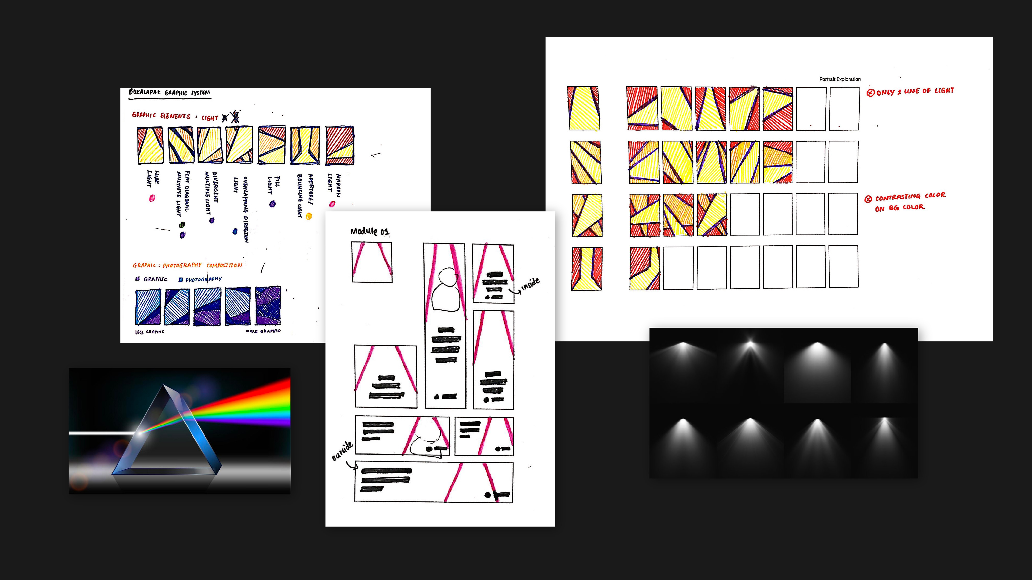
Putting into consideration the needs of the graphic elements to be as much recognizable as it is versatile, the shape of diverging lights tick off these two. The basic form promotes expansion and reimagination of the elements to avoid monotonous long term use, with already some extended shapes suited for initial applications.
The final deliverables of the rebranding put together the whole brand system into a comprehensive brand guidelines which Bukalapak Design later extends and develops the publicly accessible online format to accommodate the practical use for both internal and external purposes.
The impact of identity in terms of business metrics is supposedly hard to calculate, but recognizing how people in our internal teams are all positive and pleased with the result, although as well remains immeasurable, is what matters and can't simply be denied.Yoel Krisnanda, VP of Product Design at Bukalapak
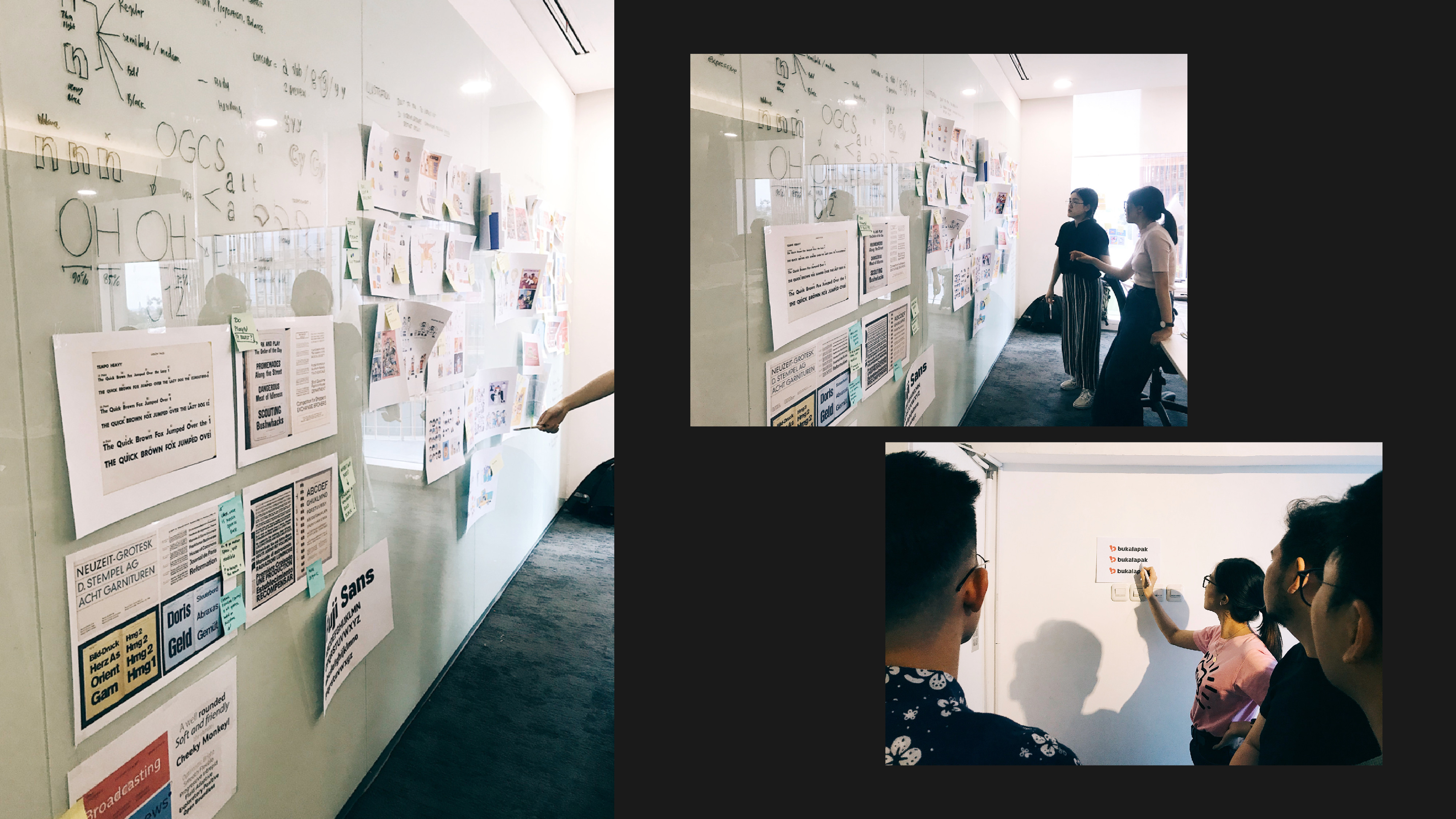
The rebranding process took almost 18 months to finish, involving a big scale of teams that have worked heart and soul, day to night through every hit and miss, iterations to major changes, ultimately bringing to light the identity of Bukalapak that we acknowledge today.
Doing a rebrand is 100 times harder than inventing a new brand. It requires more than just a client-consultant relationship but a mutual partnership that values mutual respect in every part of the way. You will never reach the finish line only by pleasing a selected few or feeding a personal ego.Eric Widjaja, Design Principal of Thinking*Room
Our website's landscape mode is best viewed in desktop & tablet, not mobile. Rotate it back for mobile viewing.
*Image courtesy of Microsoft. All rights reserved