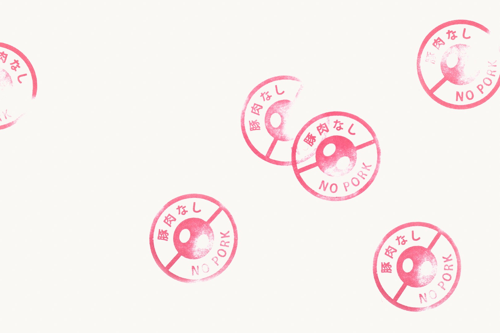
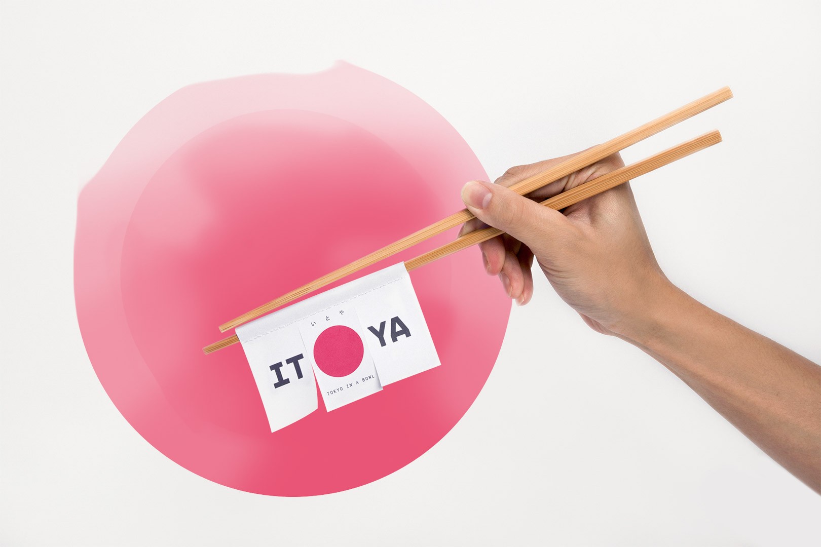
How to stand out in an ever-competitive culinary landscape already full of Japanese restaurants? Serving delicious food is certainly essential, but so is a solid and good branding. Itoya, aware of the importance of the latter, approached us to cook it.
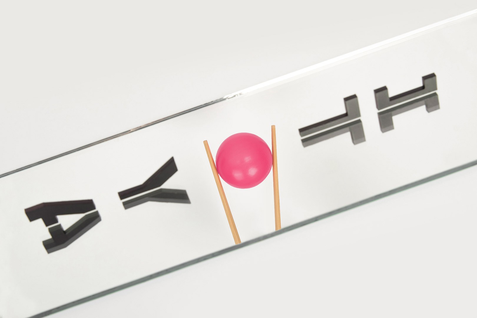
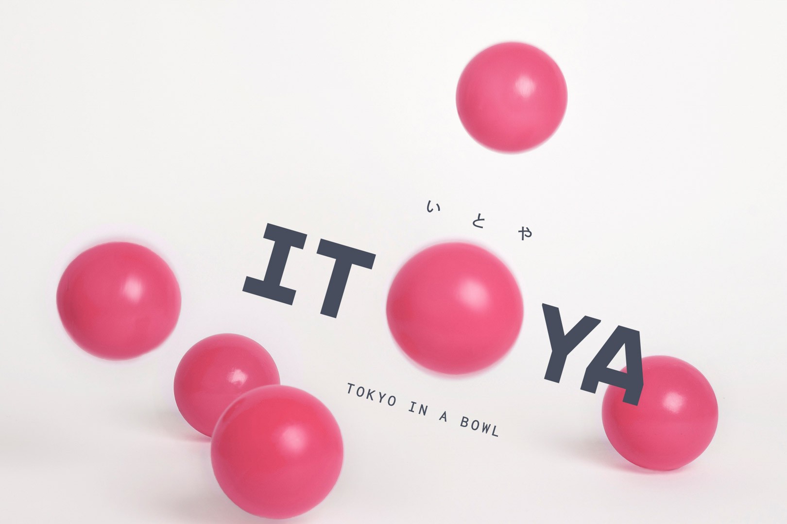
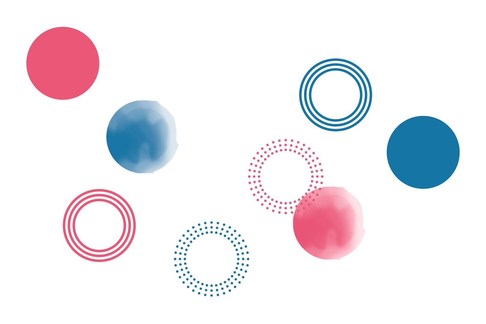
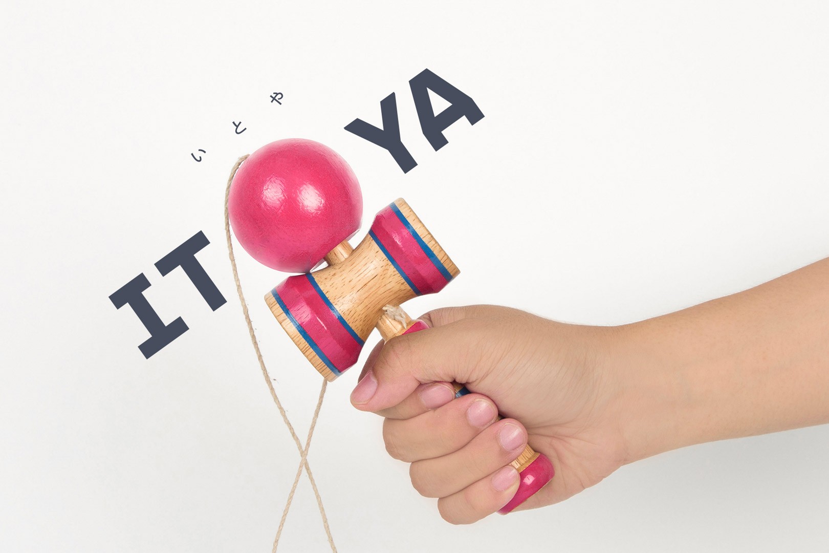
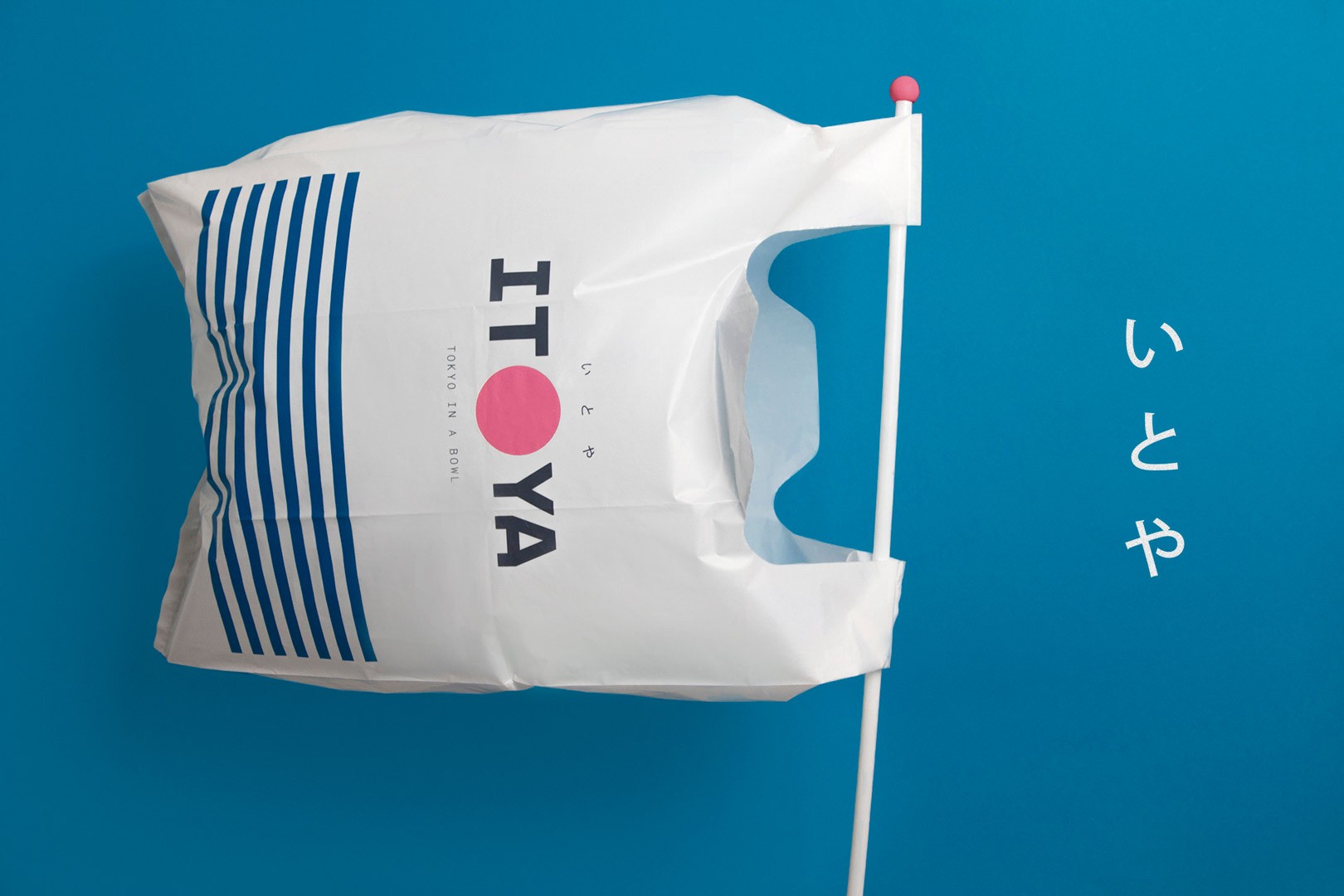
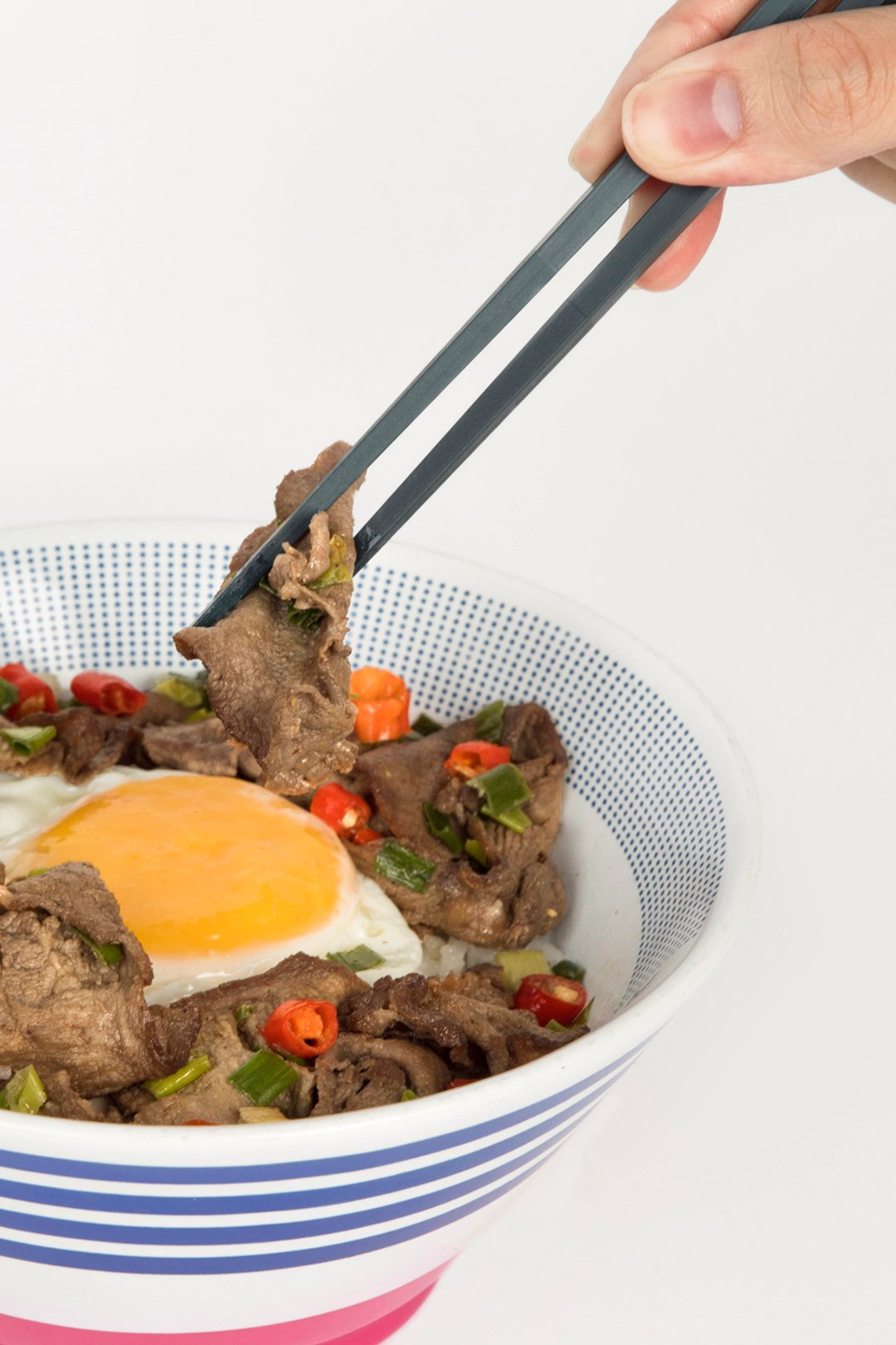
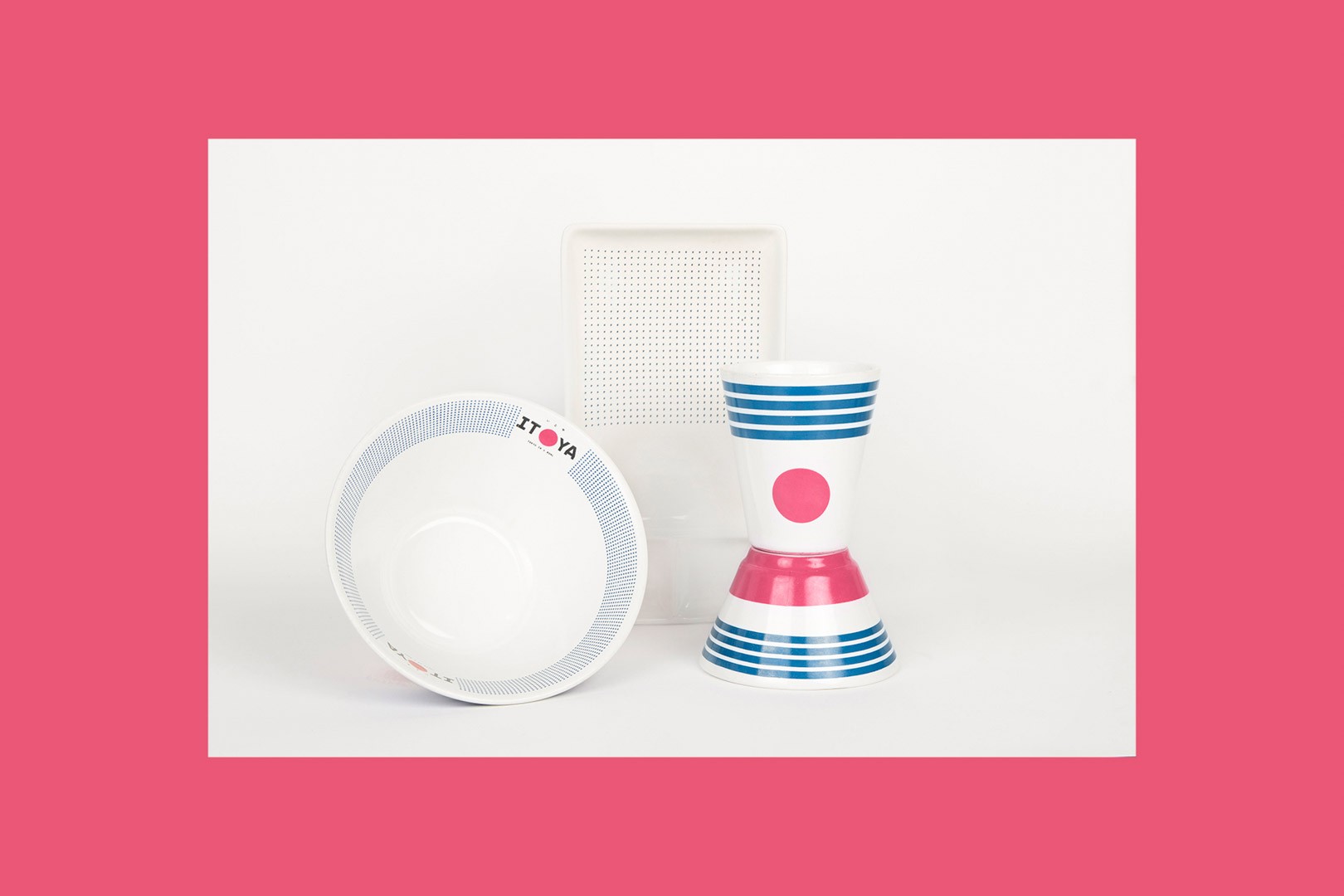
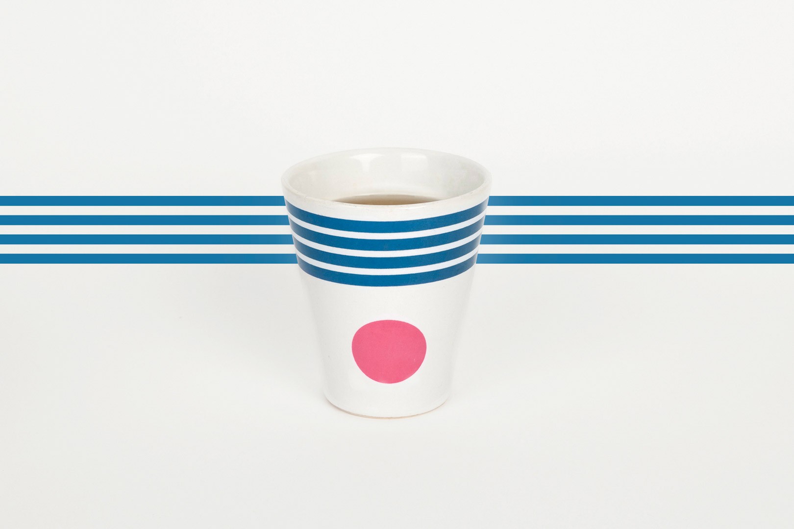
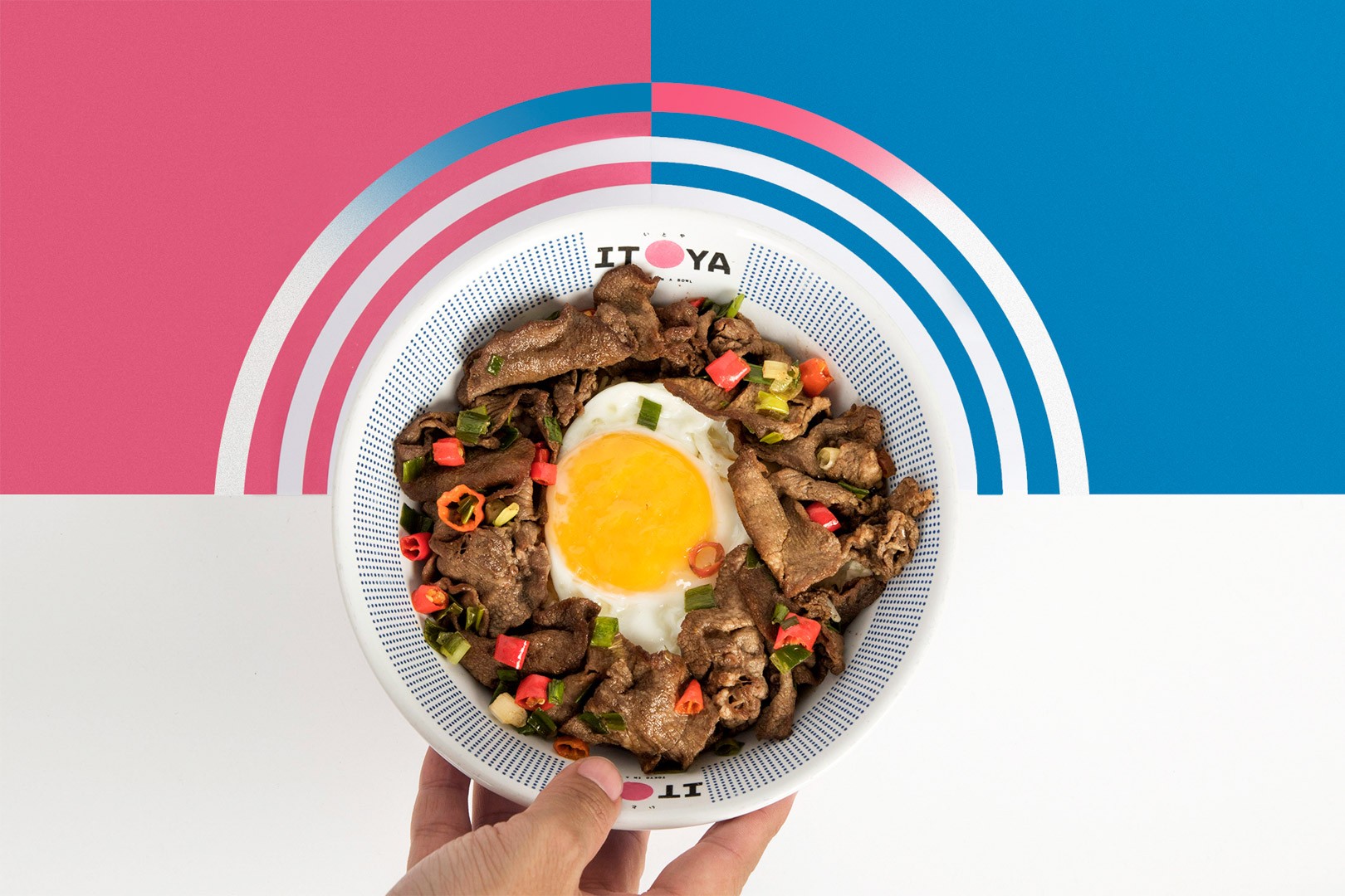
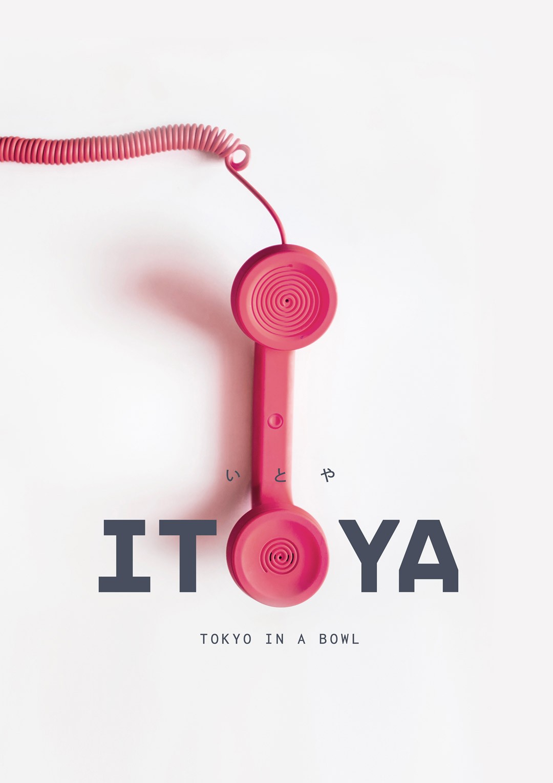
In order to visually portray the brand's motto, 'Tokyo in a Bowl', we incorporated the iconic red circle into the logo. It may come off as cliche, but there's more to the red circle: It's modular. It’s applicable in not only the logo but in numerous other things, such as the bowl design or even the typography treatment.


Our website's landscape mode is best viewed in desktop & tablet, not mobile. Rotate it back for mobile viewing.
*Image courtesy of Microsoft. All rights reserved