Our Art Director Ritter Willy Putra is joined by Typeface-focused design studio Tokotype founder Gumpita Rahayu, moderated by Eva Mega Astria in the second episode of Thinking*Zoom Inc. who previously worked on Bukalapak rebrand, to dissect the significance of type in the era of brand customization.
A typeface functions to strengthen efficiency in texts, language, and overall visual in a graphic composition setting. Well-engineered letterforms implement identity and functionality. The role of type in the establishment of a brand has become increasingly significant in the age of well-personified brands, and the idea of custom typefaces supports this occurrence. With what seems like a trend, has custom typeface been a necessity, or has it only turned into a trend?
Starting the session off by identifying why some brands decided to go for a custom type as a part of their brand identity, Gumpita explained that a typeface is a visual systemization at work to convey clear communication. However, not all retail typefaces can provide the needs of every brand.
In the era of digitization, this time around requires brands—especially online-based brands—to consider a comprehensive system that can support small screens. Custom type fits in the digital environment that ranges from online to offline. Its functions also vary from supporting small screen to engagement through its expressive way of communicating. The role of it, aside from technical and strategic purposes, is also to compose a story. With businesses nowadays that retain diversifications, this then begs the demand for a distinctive system that can be applied to brand architecture and sub-brands, and the cost- & time-efficient nature of custom type supports this need. This nature of custom type also elevates a level of brand recognition, as expressed by Ritter.
"The market is getting more competitive today. A custom typeface adds a distinctive element that uniquely belongs to that brand, and this supports brand recognition. When people don’t even have to see a logo to recognize a brand, that is one potent communication system." — Ritter Willy Putra (Thinking*Room)
Although the appearance indicates much like a trend, the subject at hand isn't a trend, it is rather a phenomenon. The impact of this phenomenon can be seen as significant glancing at brands that did develop their custom (e.g. IBM), but where is it derived from?
In Gumpita's argument, the impact of a custom typeface in supporting brand recognition comes from the nature of typeface in tying together a communication system that speaks in one language, in a figurative sense. When a fitting typeface is chosen for a brand, it enhances the brand's unique points which make up its characteristics, further enhancing well-tailored brand perception and experience that applies to both bigger and smaller brands. This level of brand recognition by a typeface is also evident when putting color aside. Gojek and Grab (both are ride-hailing services well-known in Indonesia) use green as their identity but an element such as their typefaces makes a powerfully-distinct difference, which supports the grounds for typeface being a highlight to a brand that does it subtly yet prominently.
In the argument whether a brand should create their custom typeface, Ritter expressed that the weight falls heavily on several thorough considerations backed with clear intentions of unambiguous communication. It all comes down to the needs of the brand. Hence, when do brands decide between a custom or a retail typeface?
As stated by Gumpita, it all comes down to the situation and condition a brand is in. The questions beg to ask what the brand hopes to achieve through their type, where the brand heads towards, whether the type is for internal or external purposes, what is out there in the market, what the competitors use for their brands. A factor worth considering is licensing, which calls for media usage that needs to be precise number-wise and entails costly subscription for a retail type, but granted, is a quick shortcut. Media usage—whether it would be used offline or online, how many weights we would use, how many users there would be, desktop or phone, how many screens would there be—is another factor to keep in mind when purchasing a retail typeface.
The benefiting factors of a custom typeface as discussed by Gumpita and Ritter are as follow:
1. Exclusivity. A custom-built typeface embodies an element of exclusivity that belongs only to that particular brand, fitted like a suit made by bespoke tailoring.
2. Identity & value. It composes a story through its ability to define a brand's personality and voice. A coherent story that only belongs to that particular brand, which inherently uplifts and refines a brand's values.
3. Consistency. It narrates the brand's story whilst maintaining consistency for all communication media.
4. Flexibility. Unlimited glyphs scope in different languages and flexibility that caters to the brand's needs also become major beneficial factors for custom-built typefaces.
5. License. A custom typeface belongs to its brand for as long as time goes in ownership in terms of licensing, and so media usage concerns become no longer a concern. This means that the customized typeface belongs to its brand, quite reasonably, forever.
When you need a suit or a dress that would best represent you, would you rather go to a fast-fashion retail shop or a tailor? — Gumpita Rahayu (Tokotype)
When asked about the challenges in developing customizing a typeface for a brand at Tokotype, Gumpita emphasized communication to be a key factor that is highly-prioritized between departments in each stage of the process. Main characters that will usually emerge from finding unique characteristics of a brand become a lengthy conversation for the team, as these main characters need to be extended into 26 letterforms. The extensive discussion proceeds to a great deal of fixing, which needs to be transparently discussed with the client. "There's a lot of back and forth communication with agencies or studios we work with, whether the result matches with what's intended." The type design team is also challenged with finding ways to breathe life into the typeface that can evoke emotions, which is the usual procedure after the typeface comes into its first few drafts.
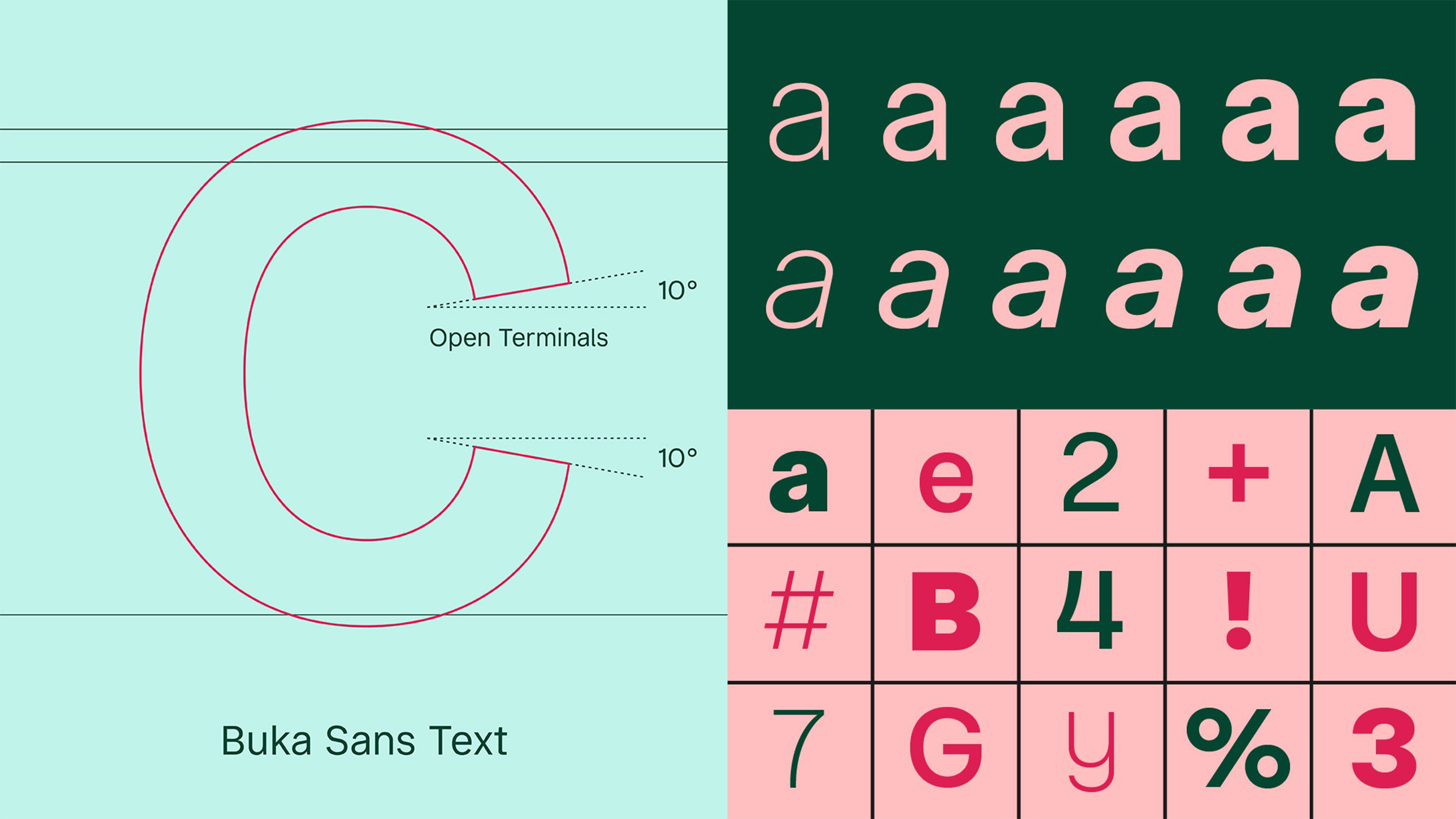
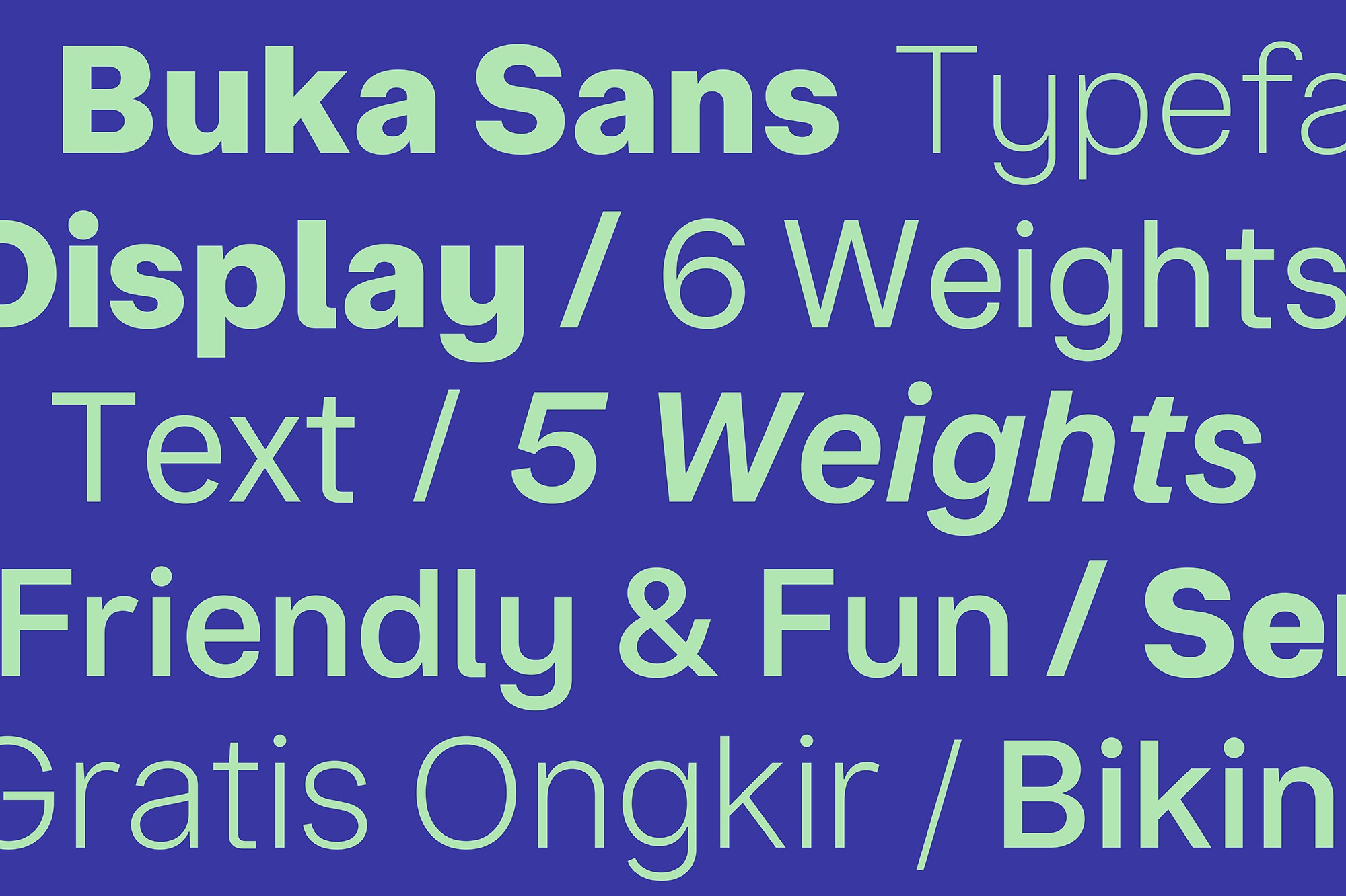
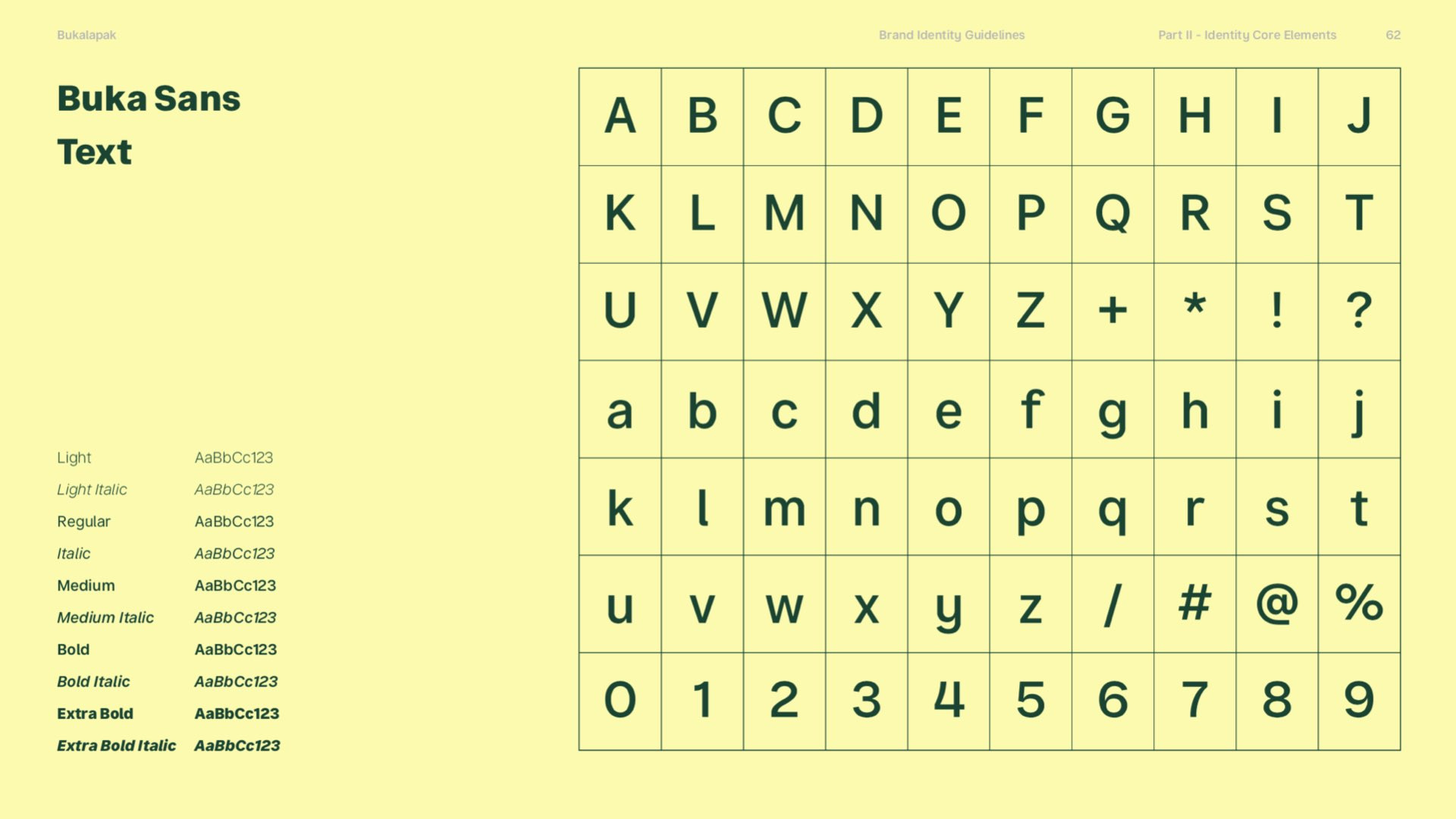
During the development of Bukalapak's recently-made custom typeface, Buka Sans for its rebrand, the design team at Tokotype was challenged with finding an approach to best accommodate expression and functionality at the same time, of which the two elements were a part of the new brand idea. The team eventually concluded the making of a display and a text version of Buka Sans. In terms of functionalities, Buka Sans Display was catered to marketing and communication purposes that narrate storytelling that's fun and empowering, while Buka Sans Text was engineered for higher legibility on small screens. Gumpita's team worked from taking the unique characteristic of the new logo and applying it to the type. For instance, the opening of the 'C' letterform took inspiration from the light beam that is one of the new key visuals in Bukalapak's new identity. This process is never creatively restrictive, hence it can go vice versa.
"There's a lot of back and forth communication with agencies or studios we work with, whether the result matches with what's intended." — Gumpita Rahayu (Tokotype)
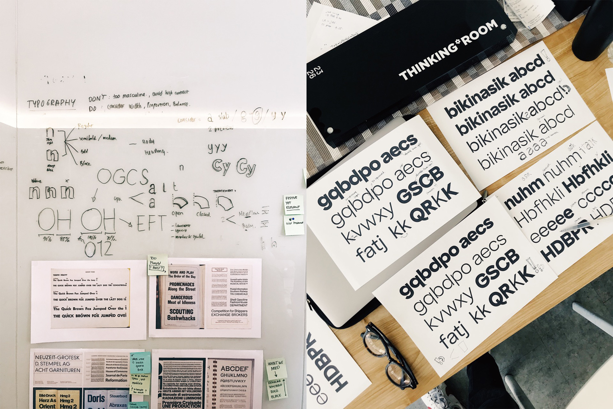
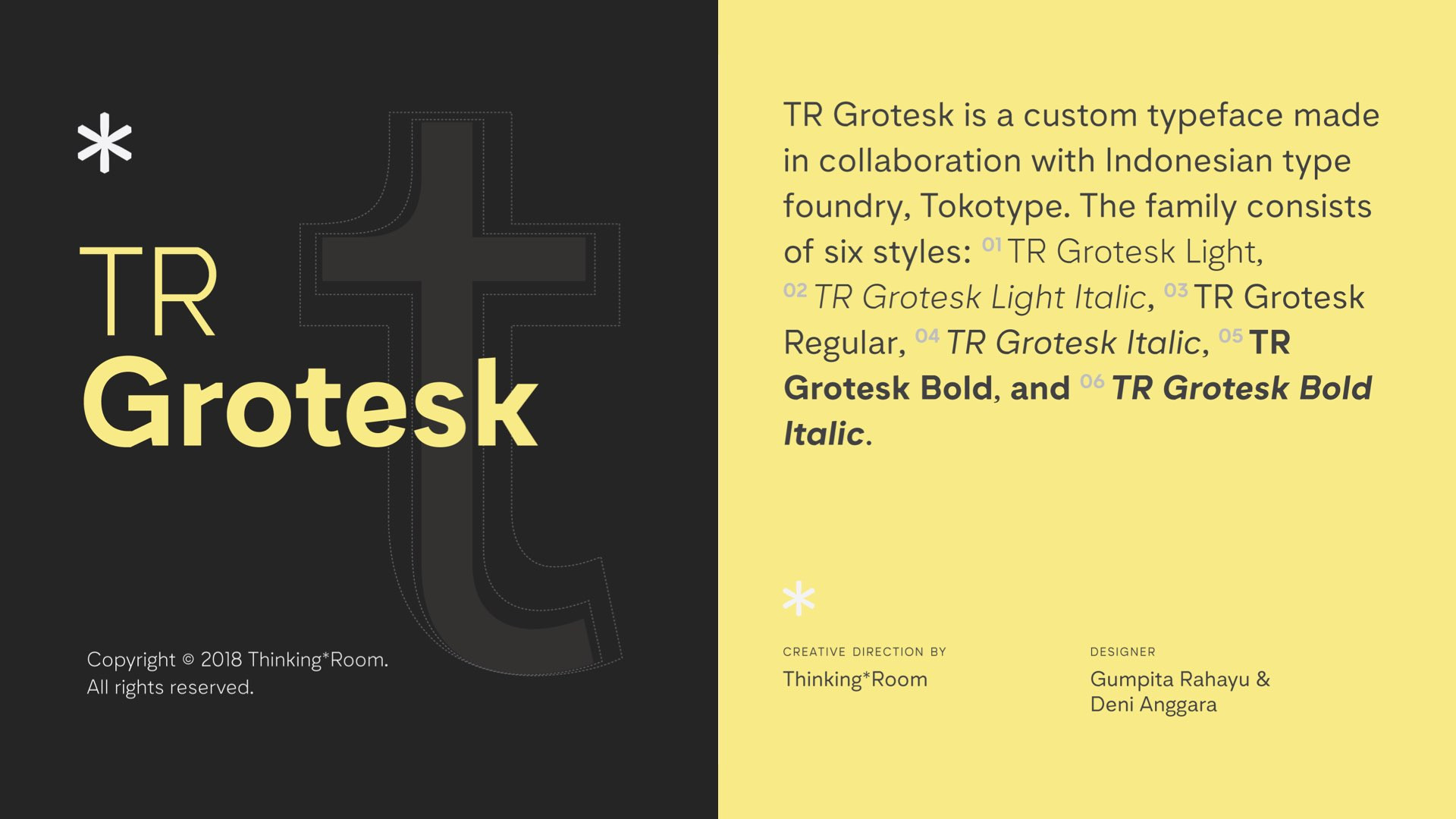
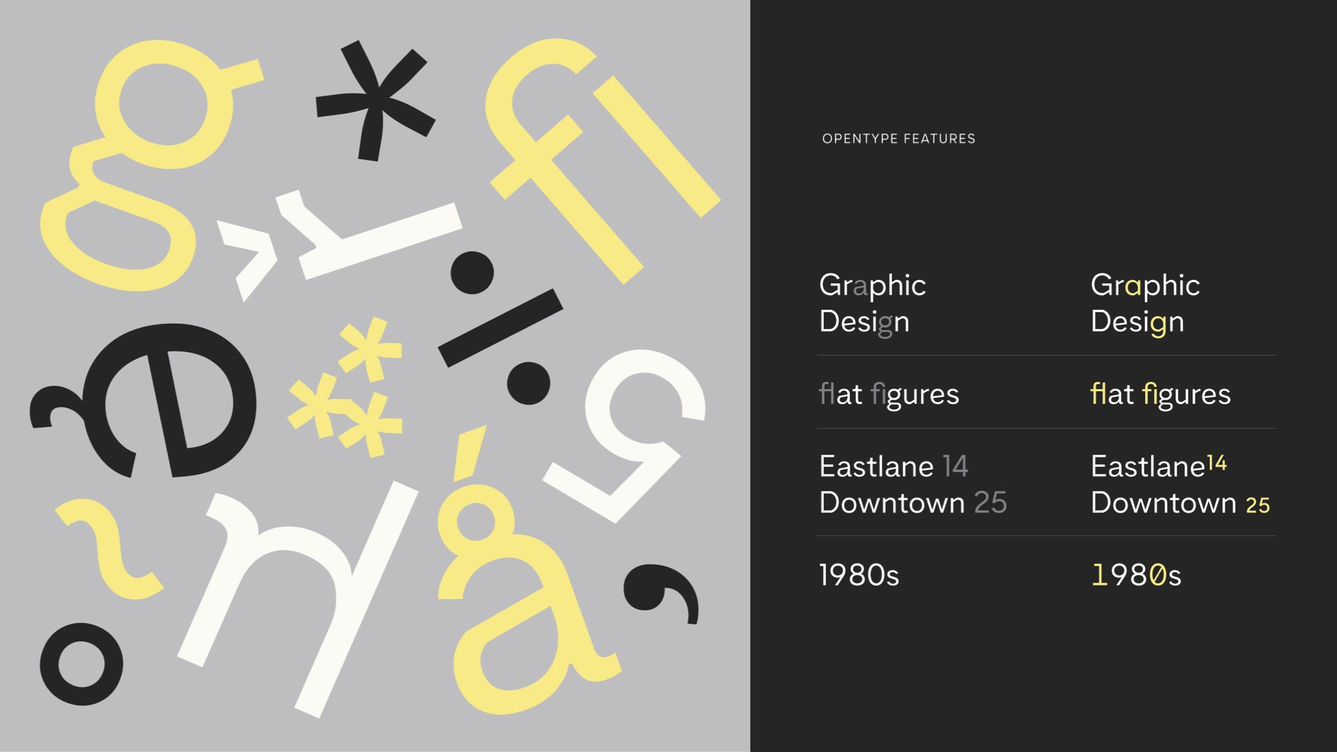
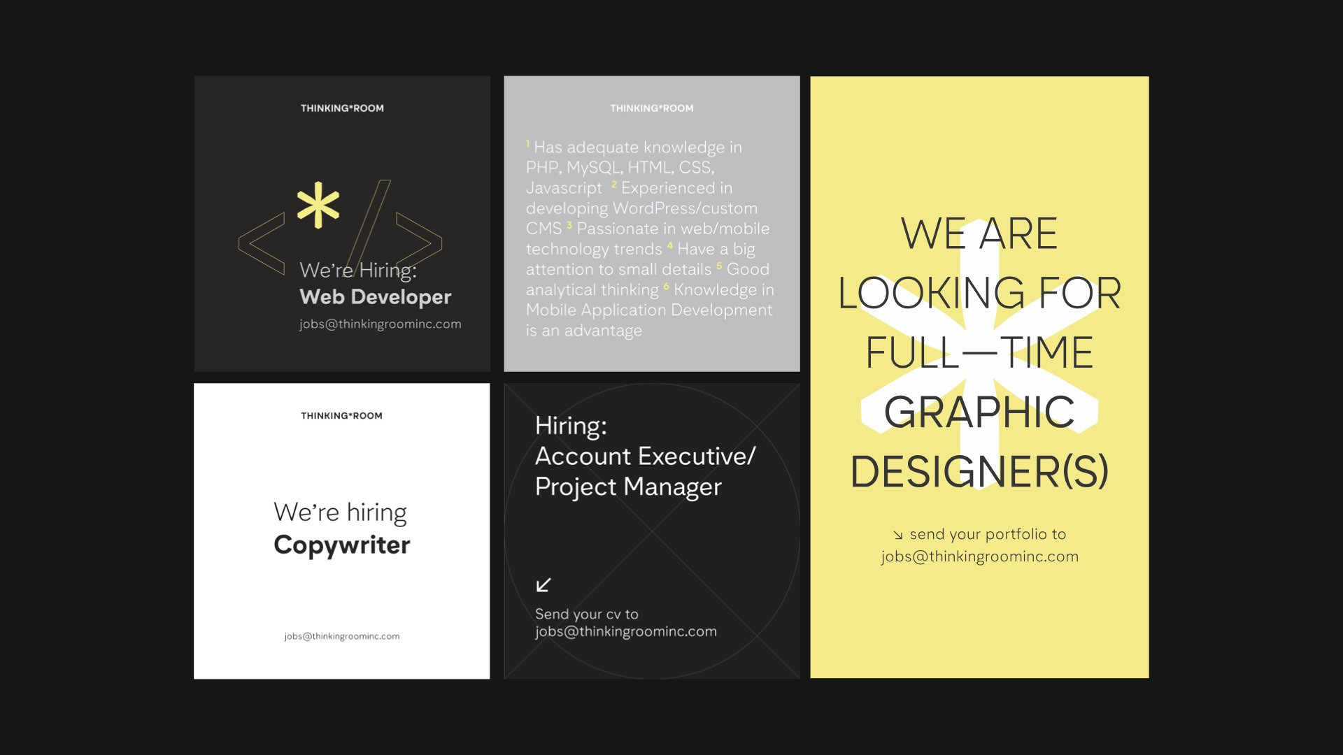
Similar procedures go to the making of TR Grotesk. Defining Thinking*Room's fitting facet in a typeface came from a process of going over considerations and working the development of our custom type out with Tokotype. Prior to choosing the custom type route, Ritter recalled finding a typeface that was fitting. However, licensing stood in the way before getting the payment done. Media usage concerns, in particular, led to Thinking*Room suited for a tailored typeface. He added that the liberating nature of a custom typeface enables for easy logo accessibilities. TR Grotesk comes with alternative asterisks, and finding the company logo became as convenient as pressing Shift+8, entailing efficiency. "It also keeps consistency for an extensive time. You don’t have to think twice to decide which font to use for a hiring poster, its time-efficient," Ritter explained.
It is worth noting the importance of reevaluating, expressed Ritter, and to his recollection, what did and didn't represent Thinking*Room in the earlier version of TR Grotesk. During earlier steps, it was also made clear that TR Grotesk aimed for a geometric and grotesque feel that is similar to Montserrat. The influence of designers whose value is aligned, such as Jonathan Barnbrook, was taken into account. The collaborative experimentation resulted in TR Grotesk's known fracture on the joints of some of the letterforms. When this unique element was applied, the team over at Thinking*Room went into further test-drive by experimenting with different treatments and visual styles. The versatility that TR Grotesk has facilitates a plethora
of needs in which attitude can range from corporate needs to intern books without having to find other attributes to make every asset ours.
Major changes are inevitable when working the drafts out through to the final result. When a dead-end is met, creative input from all parties is invaluable. The process comprises an abundance of trials and errors, to evaluate what works and what doesn't. It is, inarguably, a process that needs to be appreciated. The decision that's made to do a custom typeface also requires mental preparation to go through all the process of the development, from the first step to its last. Communicating what's expected of the type and knowing exactly what to go for will always be helpful for the type designer or design team. That being said, the entirety of developing a custom typeface is inherently all about collaborative work.
Our website's landscape mode is best viewed in desktop & tablet, not mobile. Rotate it back for mobile viewing.
*Image courtesy of Microsoft. All rights reserved