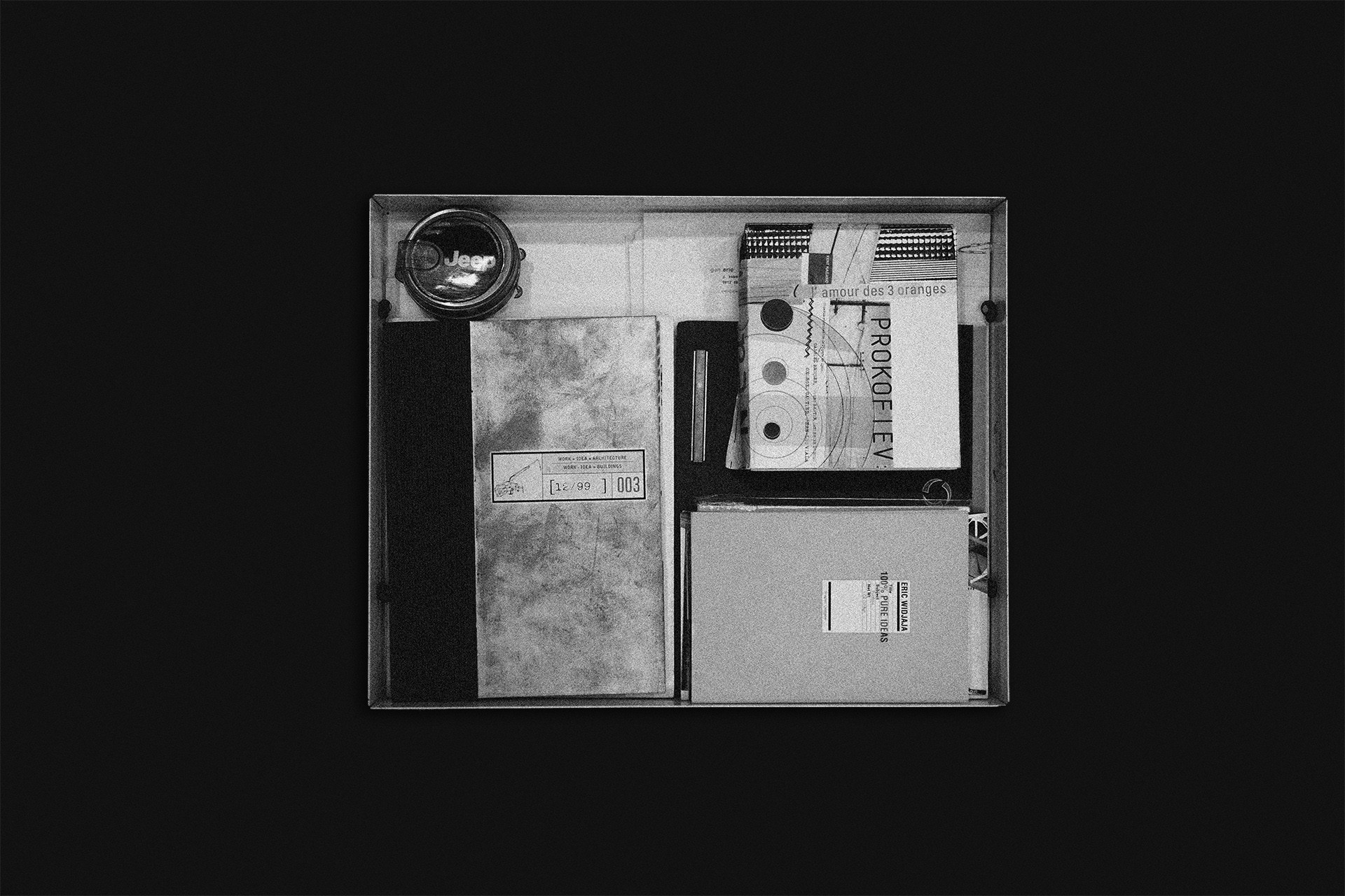
In the memory lane was an unwritten history of every design student making their first piece of work or landing their first portfolio at their first dream job and every other first that carry on the story of one's creative pursuit. And today, we were walking down the distant past to where 15 years ago in 2005 Eric Widjaja first founded Thinking*Room. Another 2 years back to when he has just flown back to the homeland and 6 years back when he first landed his design portfolio to work for a small advertising agency in the United States. Finally, it takes us back to where most of us probably started, a design school.
Pursuing a graphic design career might start as early as a child's artsy scribble or a youthful dream for some. As for Eric, bumping into an art school was simply an exit plan, for he enrolled a major in Industrial Engineering back in 1995 until he called it a quit almost two years later. It was after then that he started studying graphic design as a student in the Academy of Art University in San Francisco, a discipline that stays with him to this present day.
With a keen ear for music, Eric's college years were mostly filled up with musical activities along with all its festivities. It might occur to some as boring, but from joining lots of bands and playing on different stages to making demos and producing a record, these were almost the centerpiece of his student life. But among other things, he enjoyed his time being a design student.
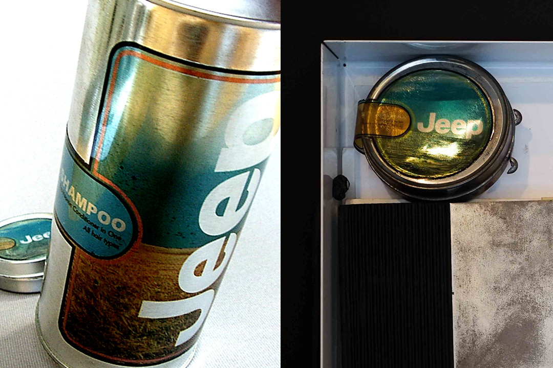
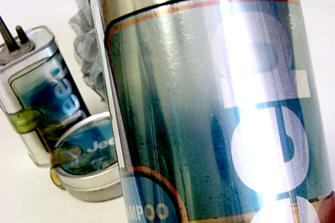
Jeep Hair Care Product
Class: Packaging Design 1
Year: 1997, Year 1
Brief: Creating a hair care product line by choosing whatever brand out there that never did/had a hair care product previously.
"Before I decided upon the brand, I questioned myself what type of hair care product I wanted to do. My thought back then, as I would recall, was that hair products were strongly related to women. My immediate response was then to oppose what has stereotypically been done, hence creating a hair care product for men that is boldly adventurous and strong, packed in a raw unfinished sort of way. At last, I went with Jeep, a brand that would represent, if not embodied, such elements."
"I remember that the design process wasn't too much of a problem as the concept and direction was already clear and strong earlier from the start. I would straight proceed to the hardware store and bought a bunch of types of aerosol, glue, thinner, paint container, and any resemblances for the basic forms of the packaging shape. I then scrapped all the labels so they all looked bare metal containers. To put everything in place, I looked for outdoor/adventurous panoramic photographs, put the logo and the type of products, printed them in transparent papers and stick them all in the containers. Believe it or not, the work got selected for our Spring Show* in 1998."
*An annual exhibition event held by Academy of Art University showing the best student works in every major.
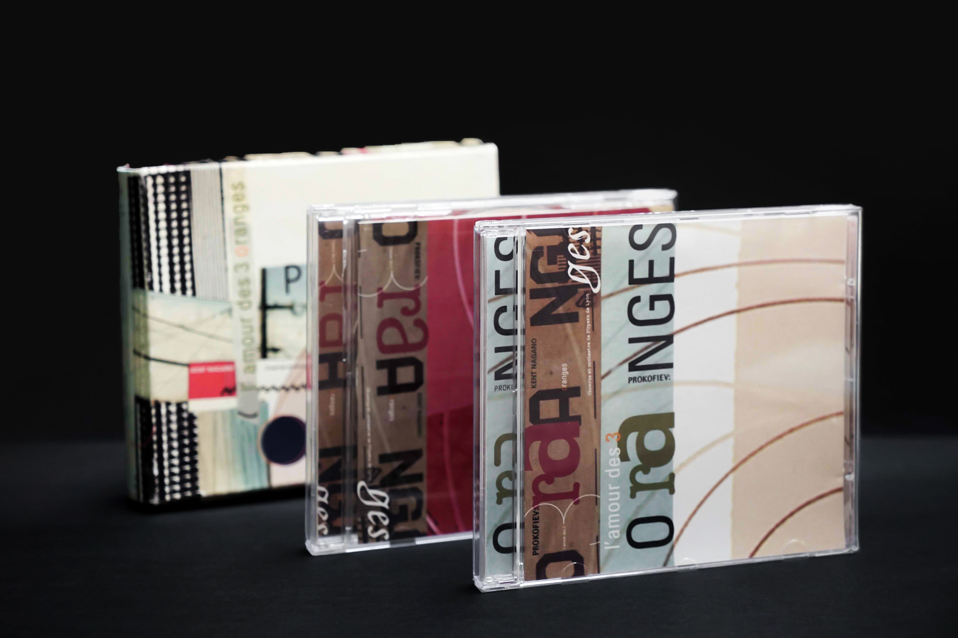
PROKOFIEV L’Amour des 3 oranges
Class: Typography 2
Year: 1999, Year 3
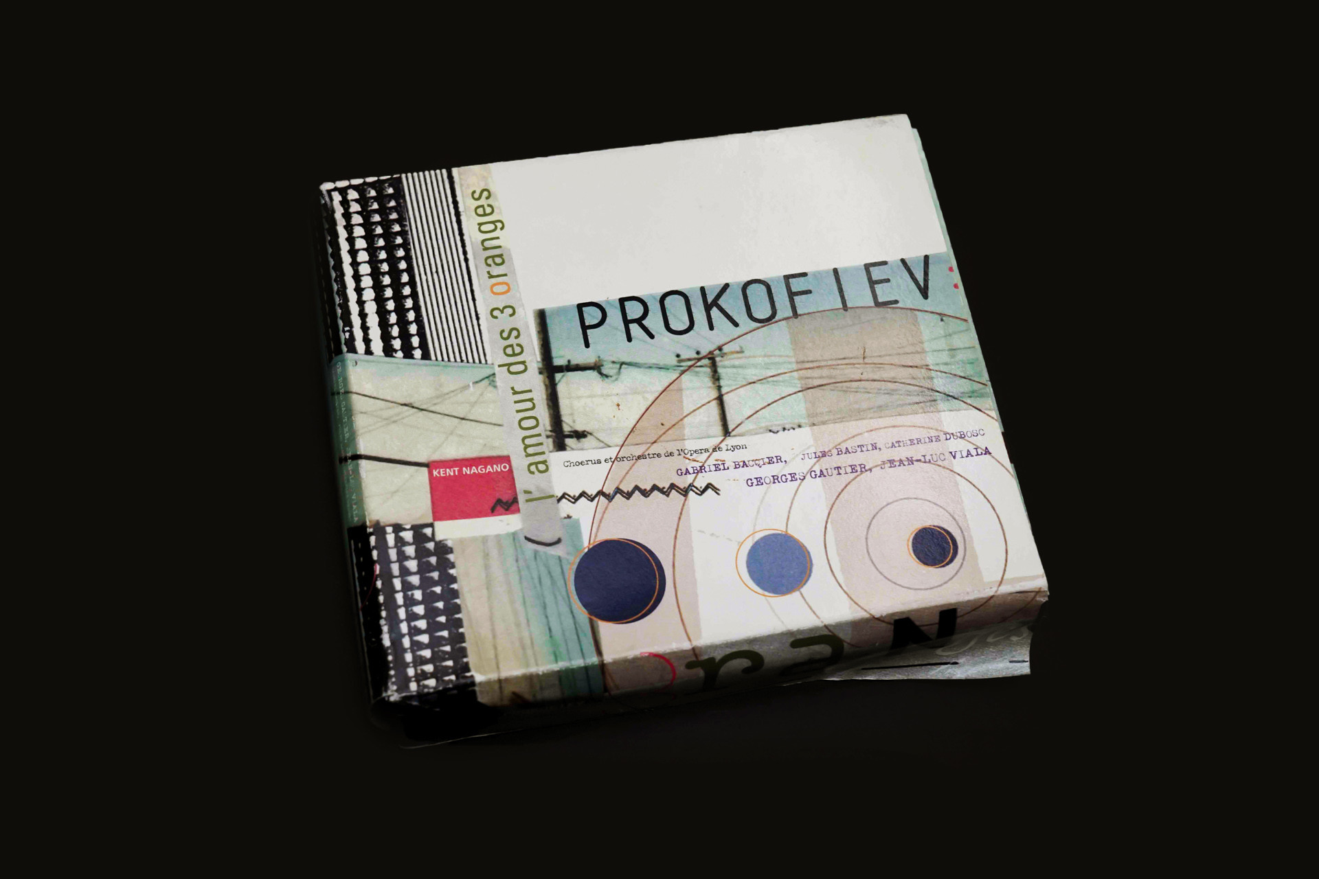
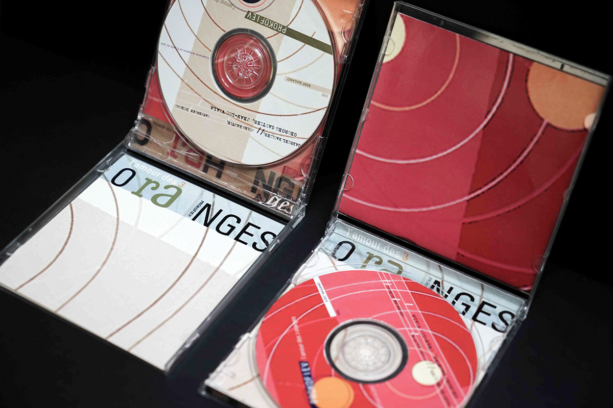
Brief: Redesigning PROKOFIEV L’Amour des trois oranges CD jacket by composing types, shapes and forms according to the music played by the composer. Students are required to mix manual and digital techniques when developing the design.
"During this year, I was heavily influenced by the work of David Carson to the point where my collections of RAY GUN* would fully occupy my bookshelves. The record contains 2 CDs, in it, was a 1-hour-40-min orchestra suite premiered in the 1920s. One way to say, the story was quite silly and surreal, with the Prince falling in love with three large oranges. But at the same time, it was actually a good fairy tale, as to say a call upon true love that endures grief would reach the final triumph. For though I wasn't a big fan of opera music myself, my first reaction to the opera was that it begone at a fast pace right from the beginning to the end. The aggressiveness and rhythmically driven music would then inspired me to do a postmodern layout with, of course, Carson’s technique of photomontage, typography collage and lots of offset/cropped graphics and letters."
*Ray Gun was an American alternative rock-and-roll magazine, first published in 1992 in Santa Monica, California. Led by founding publisher Marvin Scott Jarrett, art director David Carson, and executive editor Randy Bookasta, along with founding editor Neil Feineman.
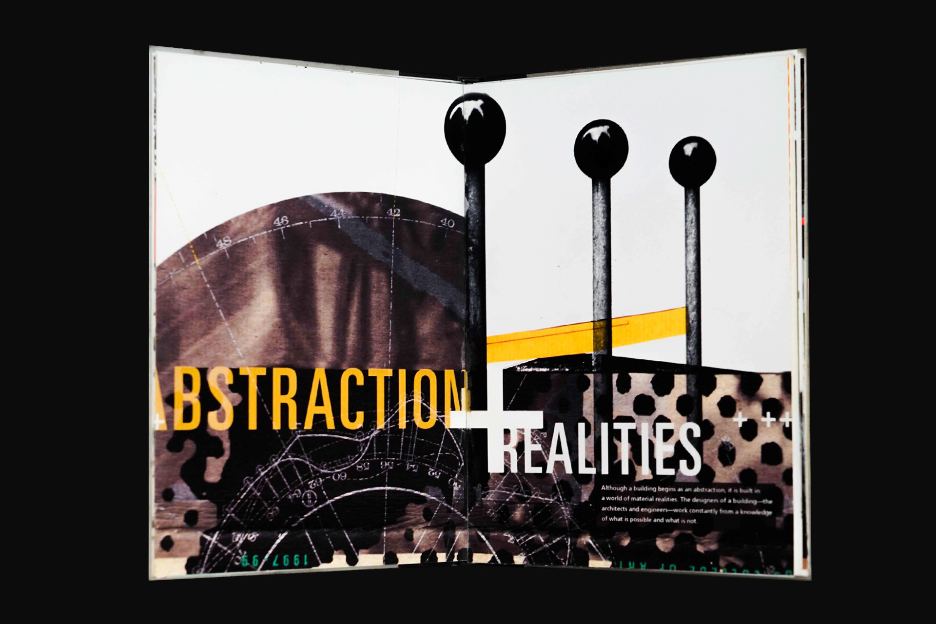

Work + Idea = Architecture
Class: Typography 3
Year: 1999, Year 3
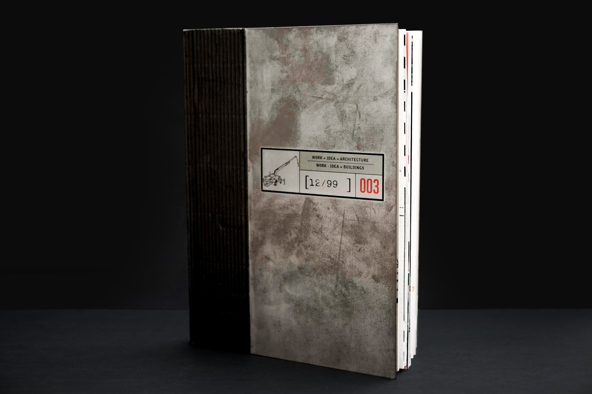
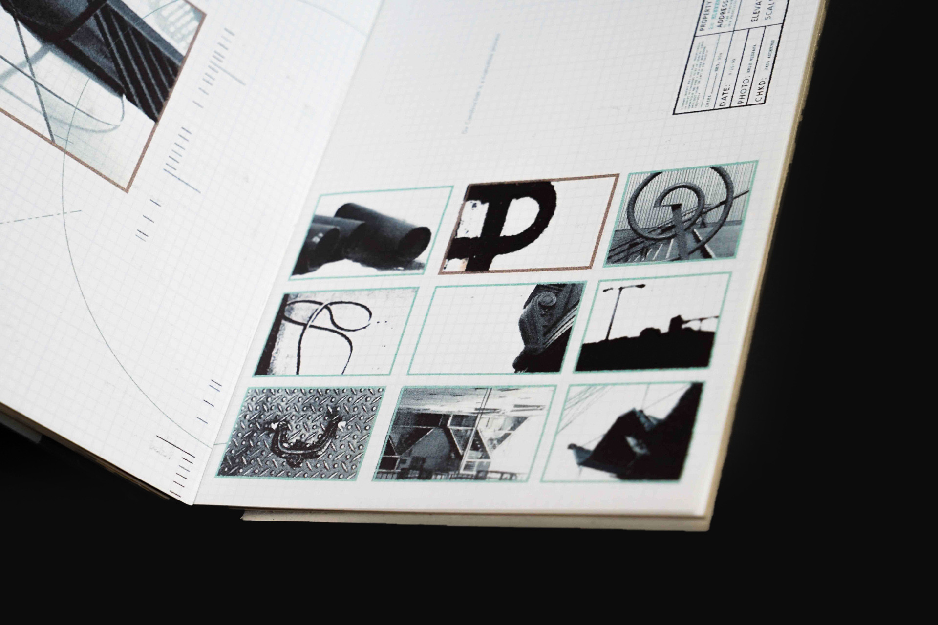
Brief: Creating an alphabet book, including the numerical, by taking photos of found objects that resembles certain letters/numbers every day. The book should have a theme of your own.
"Presumably said, was the toughest class I’ve ever had during my college year. In fact, the hardest task was—arbitrary as it was—deciding on what theme and objects were to be shot. I was a bit behind upon finally making the decision, resulting in every bit of a last-minute work. Eventually, I came up with the final proposal of The Fundamentals of Building Process. The story was anything but the characteristically process of construction itself, dating to when it was just a blueprint to when it finally stood tall on the ground. By coincidence, there was a construction site nearby to where I would always walk past every other day I left the campus for home, a public sight so big but oftentimes went easily overlooked to the eye. I took the chance to collect lots of objects found around the site, meanwhile visiting the public library to search through books about poetry, civil engineering, architecture, plans, buildings, and so forth. I used different kinds of materials from metrics paper to aluminum sheet for the technical aspect of the book, considering the concept, so that it would finally go well together all and throughout."
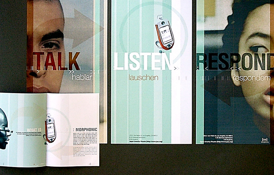 Ericsson Morphonic, 2000
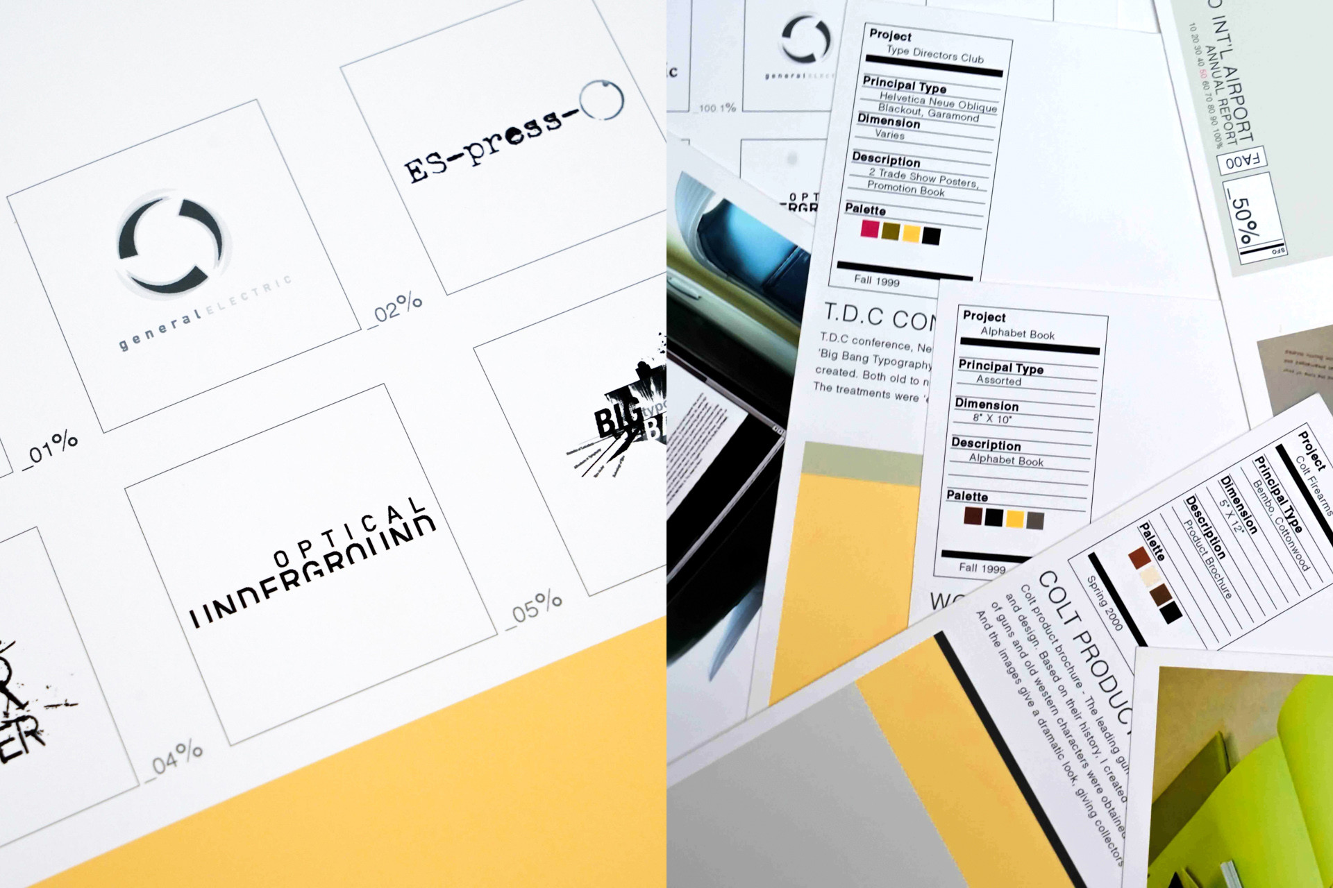
TDC Big Bang Typography, 1999
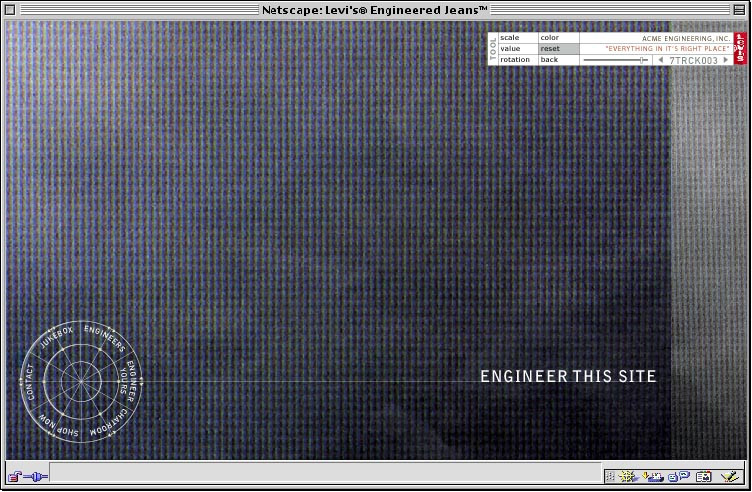
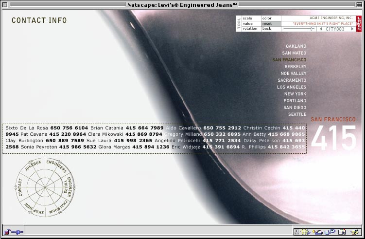
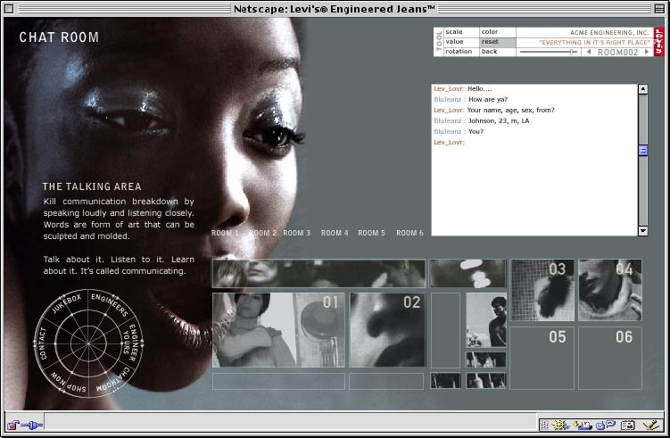 Levis Minisite, 2000
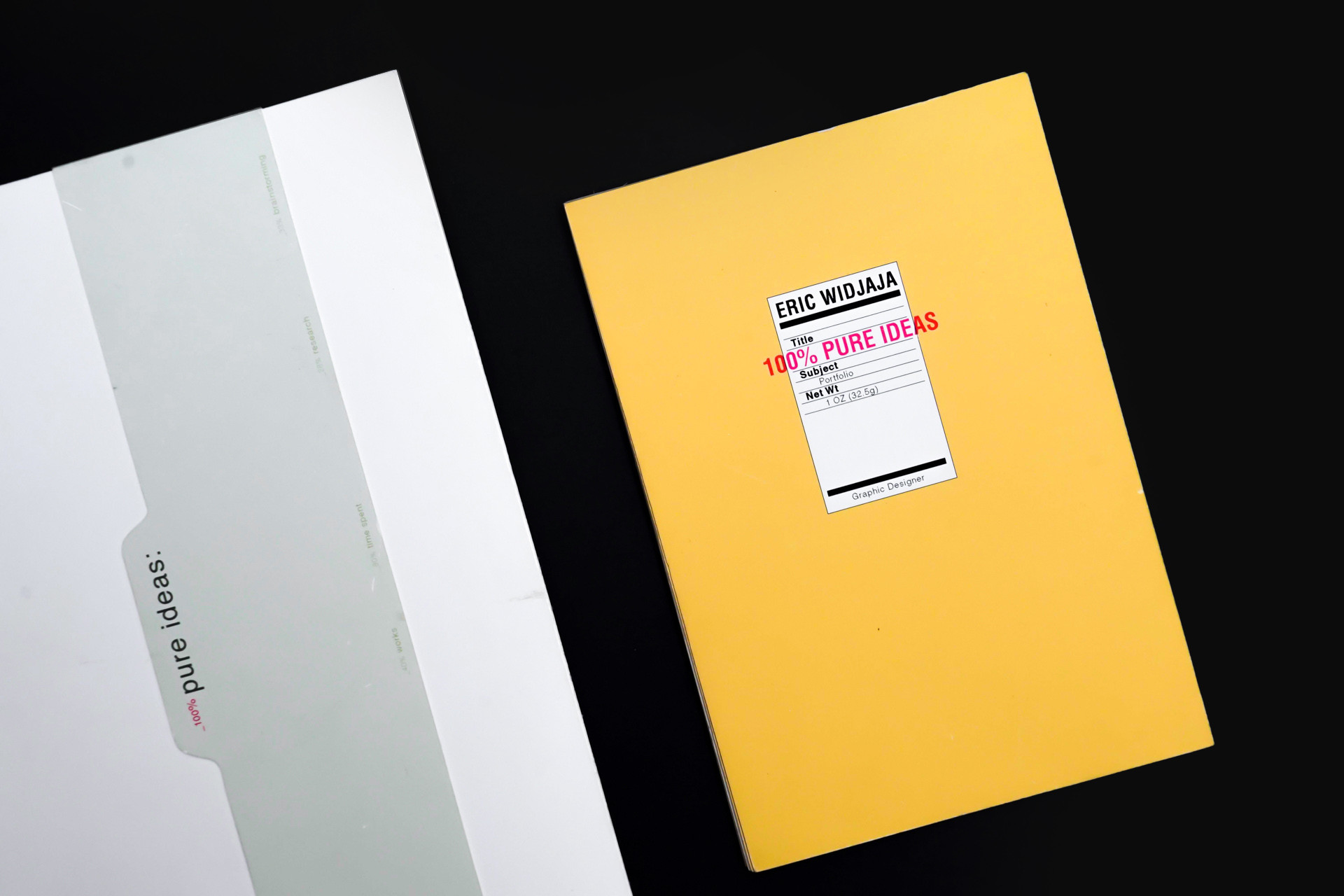 "The work that got me into my first job, a part-time job back in 1999, was my earlier college work from Graphic Design 1 Class. I did a campaign for DIESEL, made several series of posters, product catalog, gifts, etc. An art director saw my work at the Spring Show and got interested that he interviewed me the next day, and so right away began my first part-time graphic design job. The college portfolio was compiled to be sent to various design studios after I graduated. I sent it to all of my favorite studios, sadly all of them were fully occupied. I went back to my school asking my Dean about the internship openings and she gave me one contact number and found out it was an art director from Landor Associates who needed a hand to finish a very quick project."
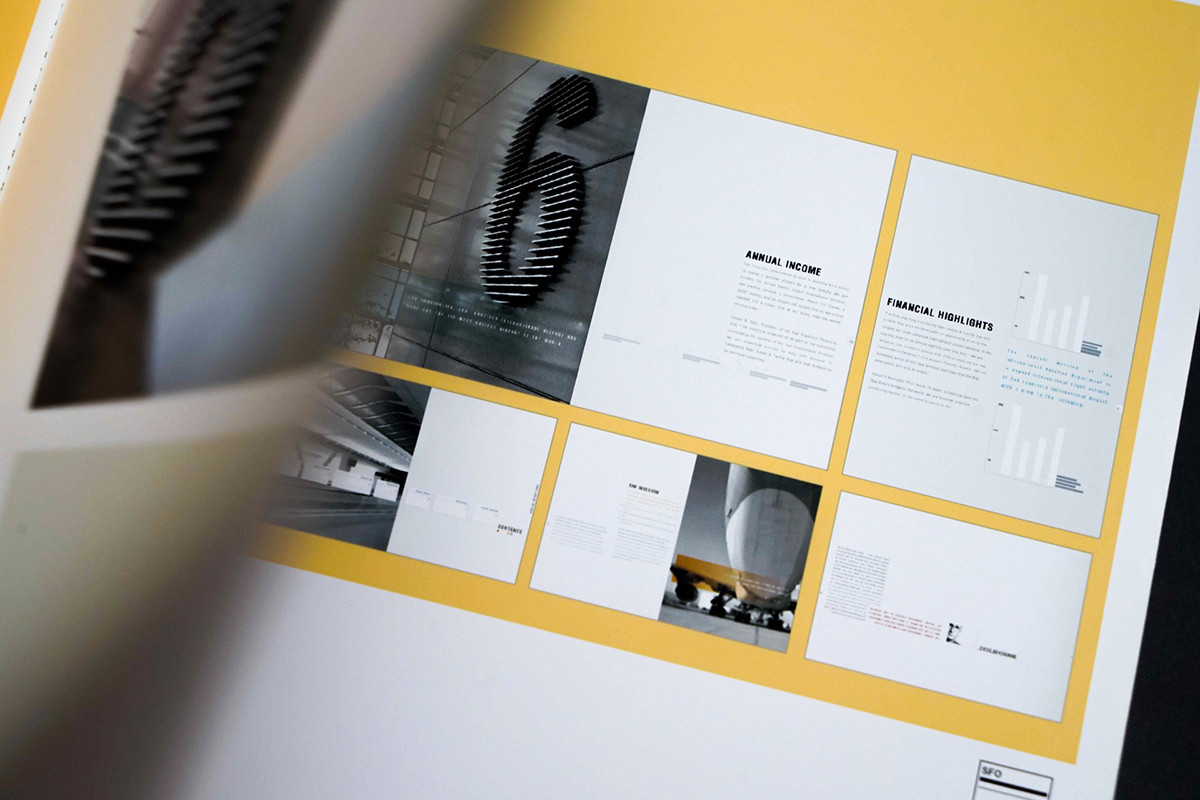
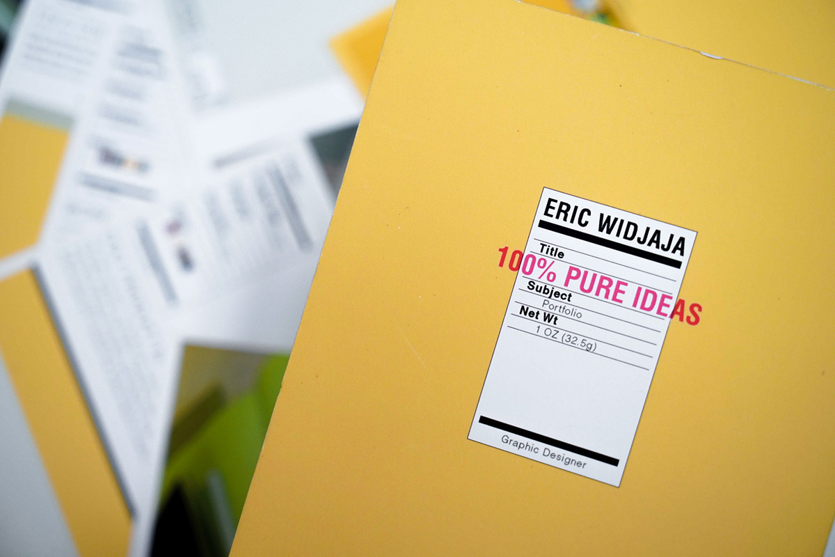
My first part-time job was in a small advertising agency, they paid me well back then. It was really one of the best moments in my life, thinking that I could make money studying graphic design during an economic crisis in Indonesia when I haven't even finished my study yet. It felt really great.
When it comes to design resources, access to information was barely the way they exist today, where one can simply find any piece of works from anywhere in everywhere. Back then, the school library would be the main source for inspirations and references, the "Behance" Eric would go to, the only place he loved to hang out in school. Luckily as it was, San Fransisco itself would offer such diversity in arts and cultures. Lots of art museums, public installations, and cool places where one can easily absorb and polish their aesthetic taste through its every nook and cranny.
Around the same time was the early days of the digital revolution, and the notion of exploring what was once an uncharted territory of layers and effects in design software was becoming downright compelling. Hence the birth of design movements like the postmodernism as well as individuals that produced a body of heavily experimented work in layouts were inevitable. Local heroes like Tolesson Design, Cahan Associates, Attik, and Jennifer Sterling were among those whose influence has been ubiquitous to his personal endeavor.
Some people believe that in graphic design industry, a specific ‘design style’ is born out of the city they live in. I remember one day my friend from L.A. told me that my design was very postmodern San-Franciscan, a case I can't explain for myself even to this day.
Our website's landscape mode is best viewed in desktop & tablet, not mobile. Rotate it back for mobile viewing.
*Image courtesy of Microsoft. All rights reserved