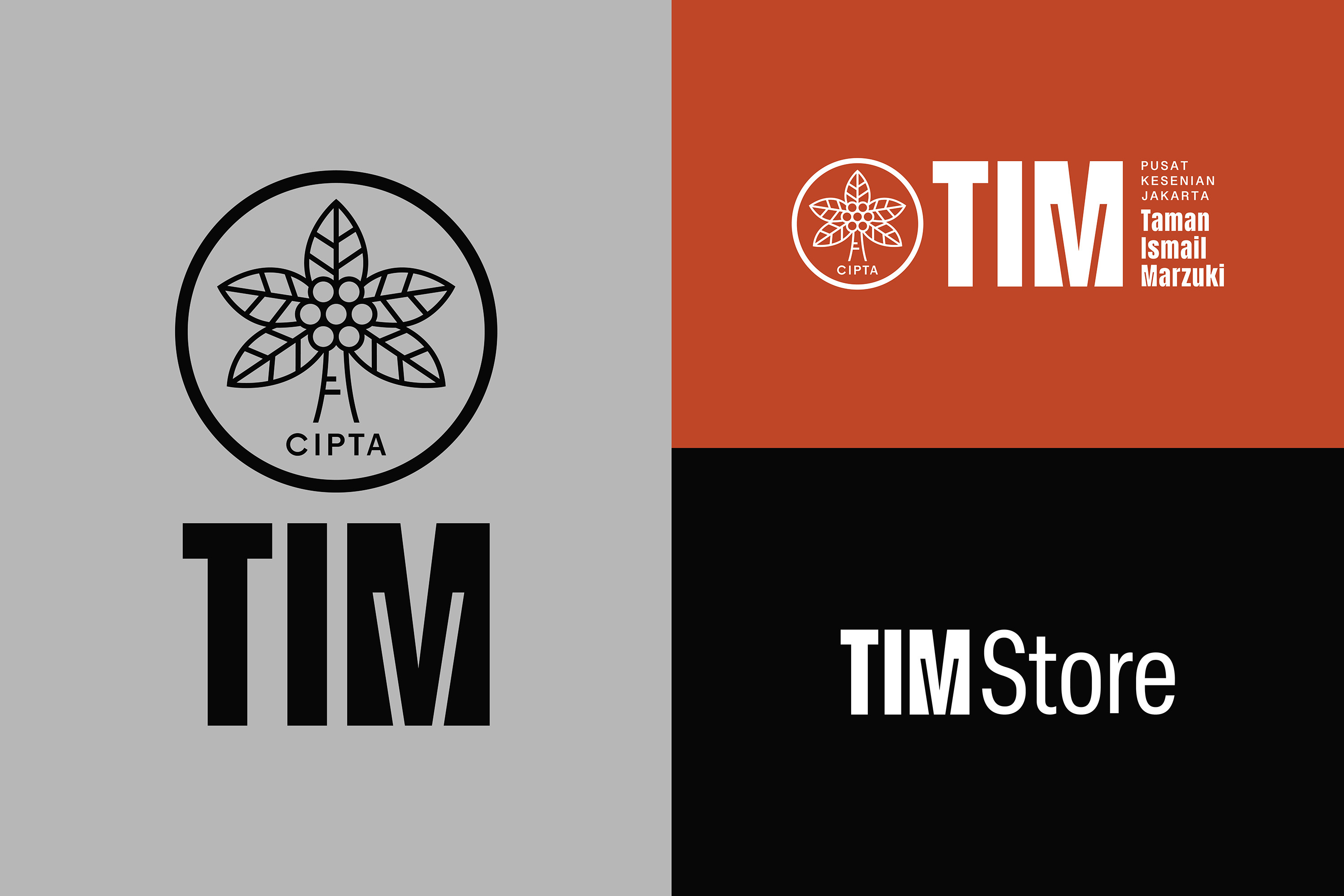
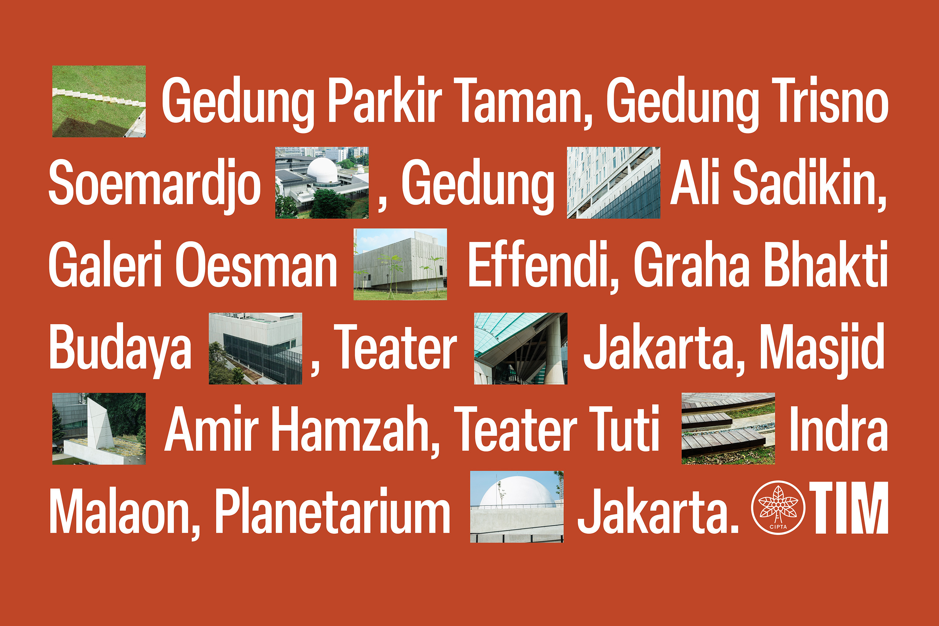
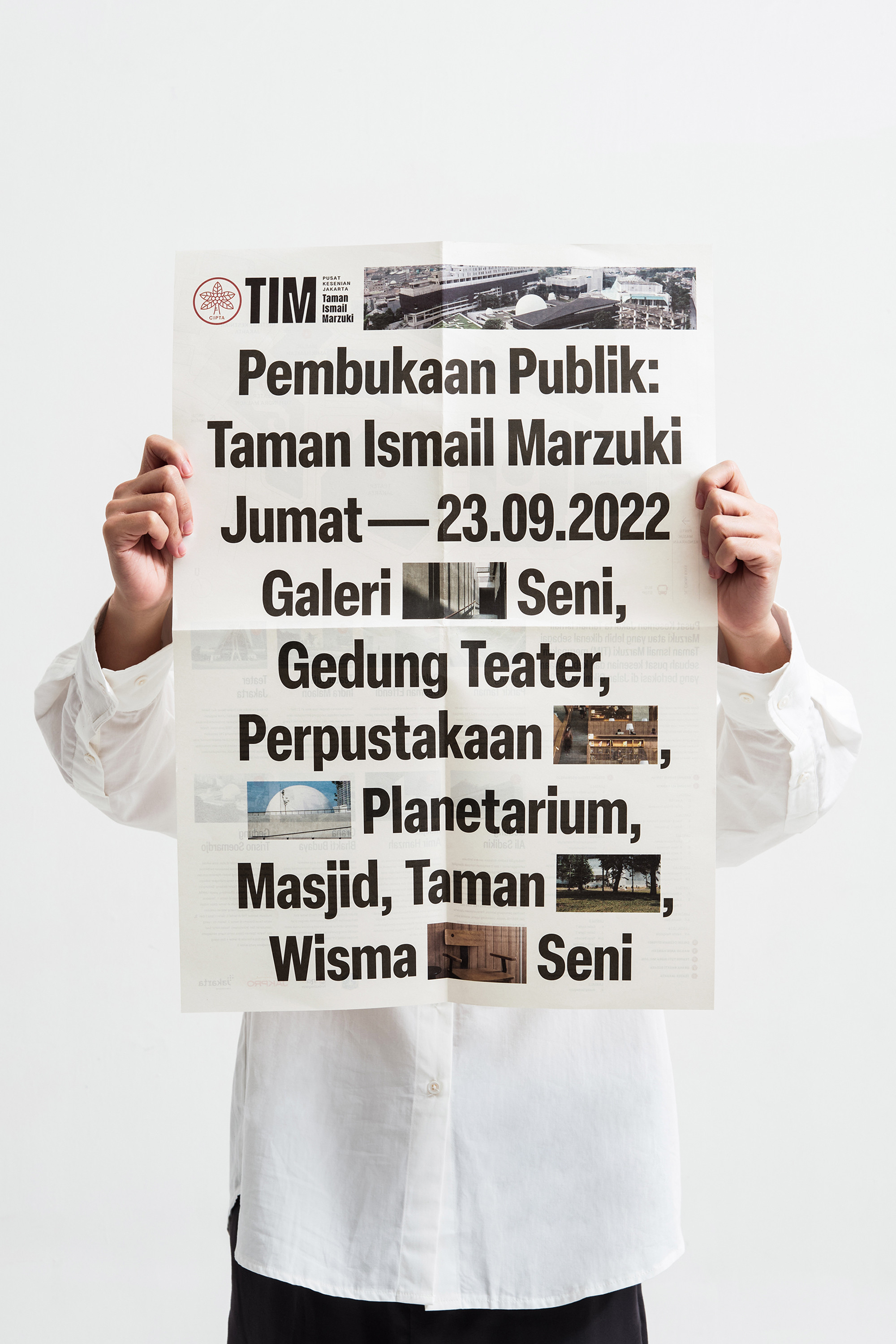
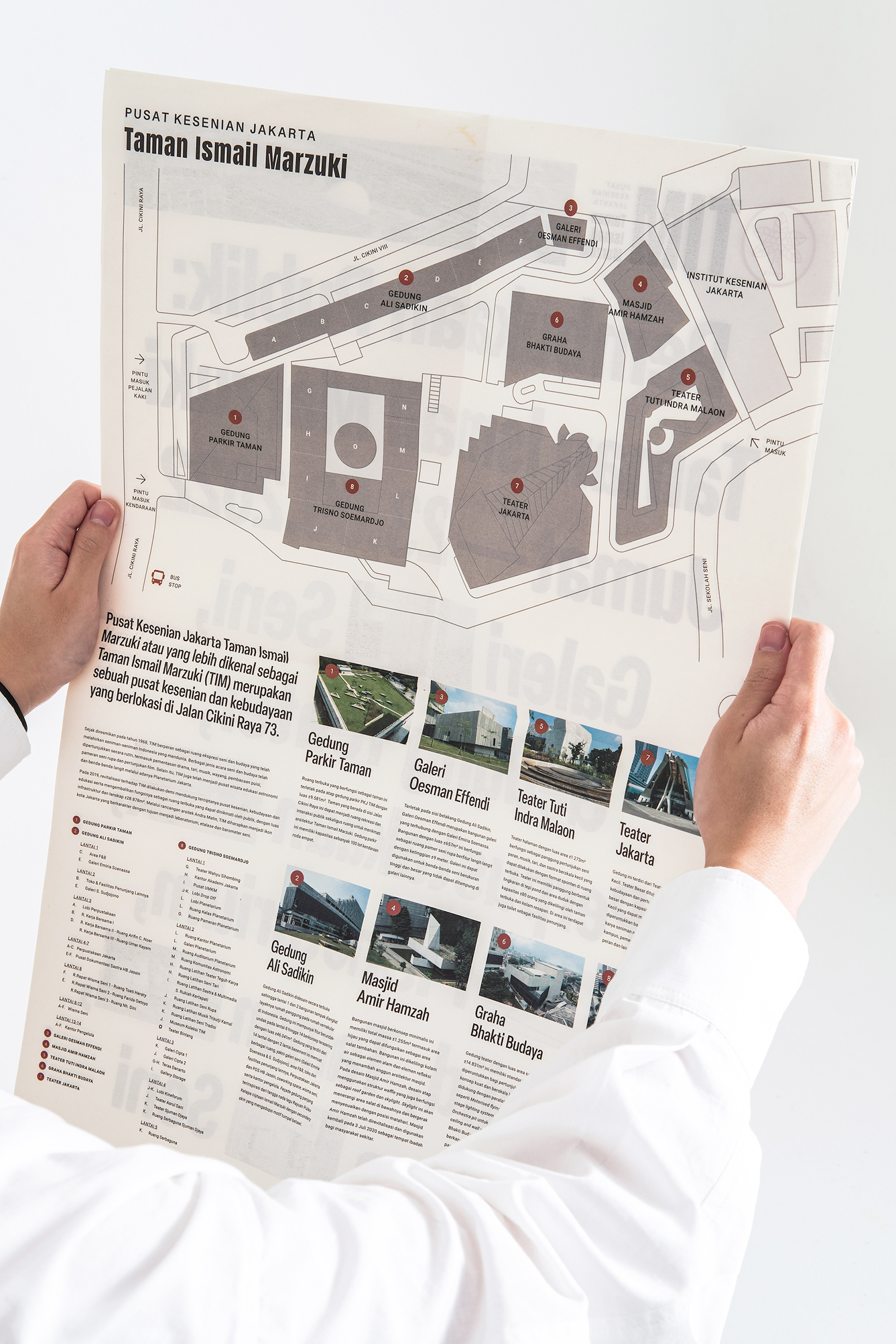
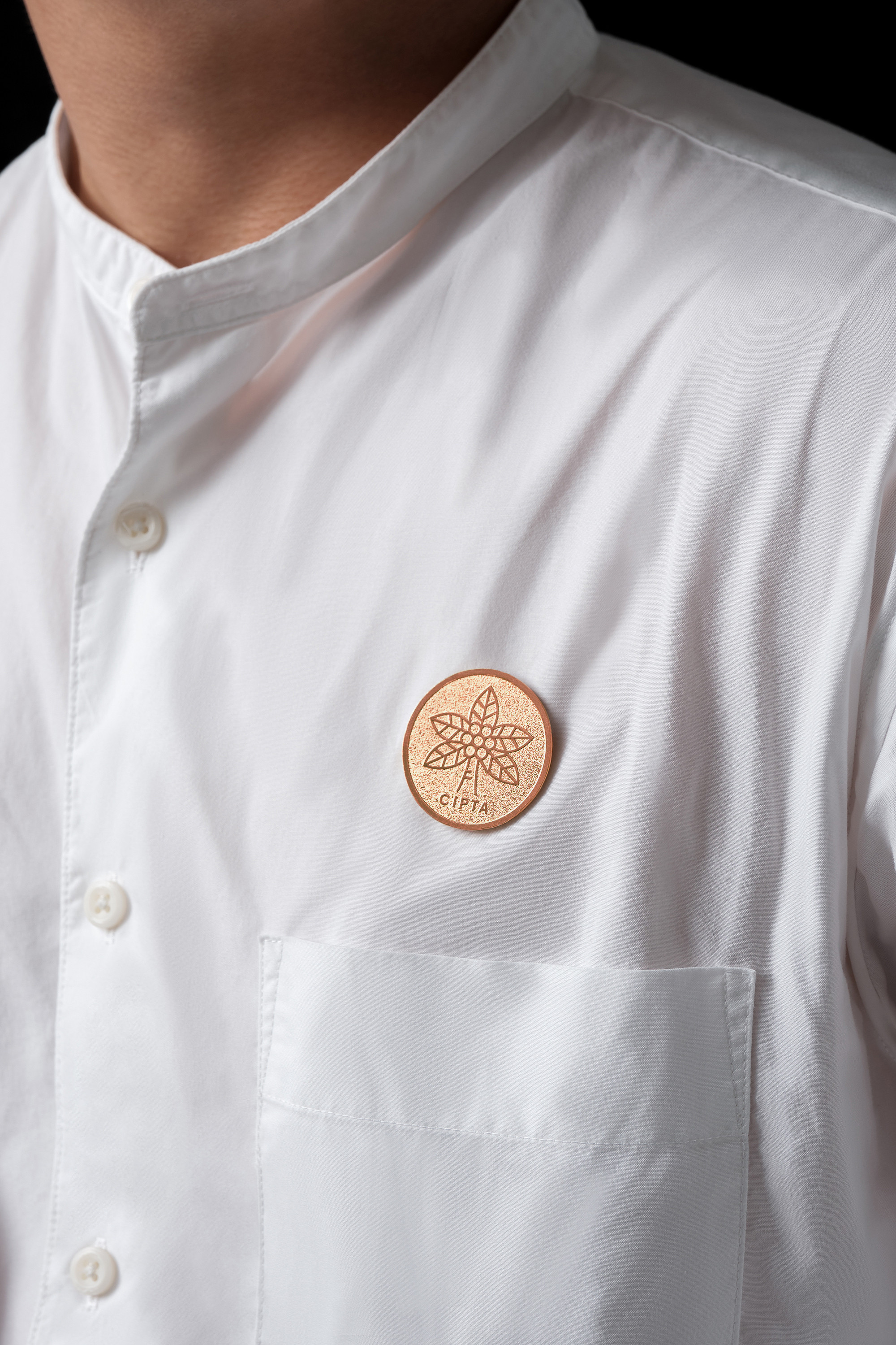
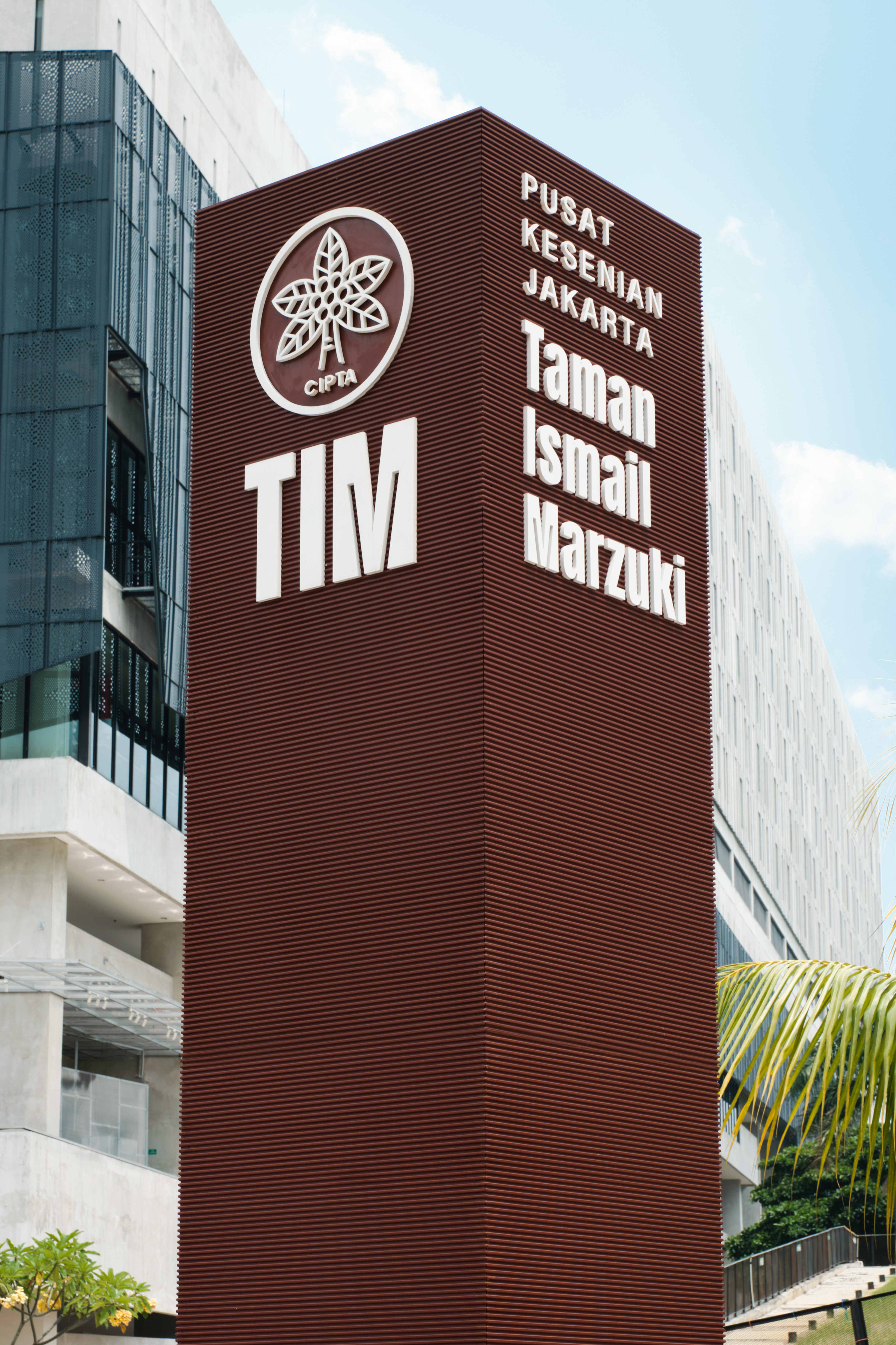
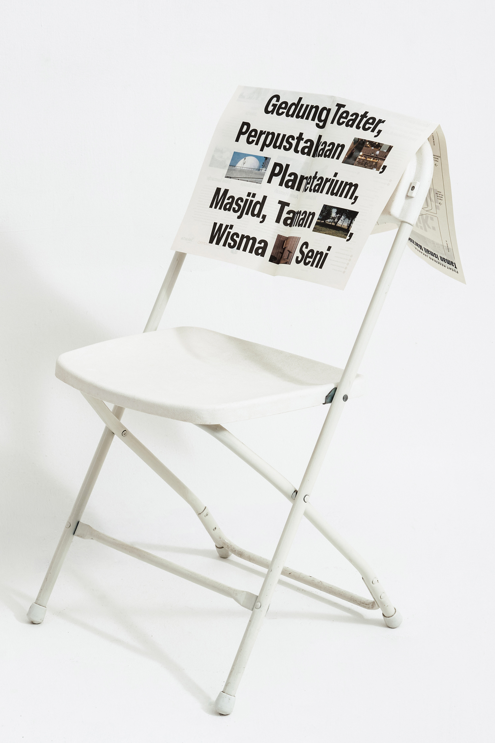
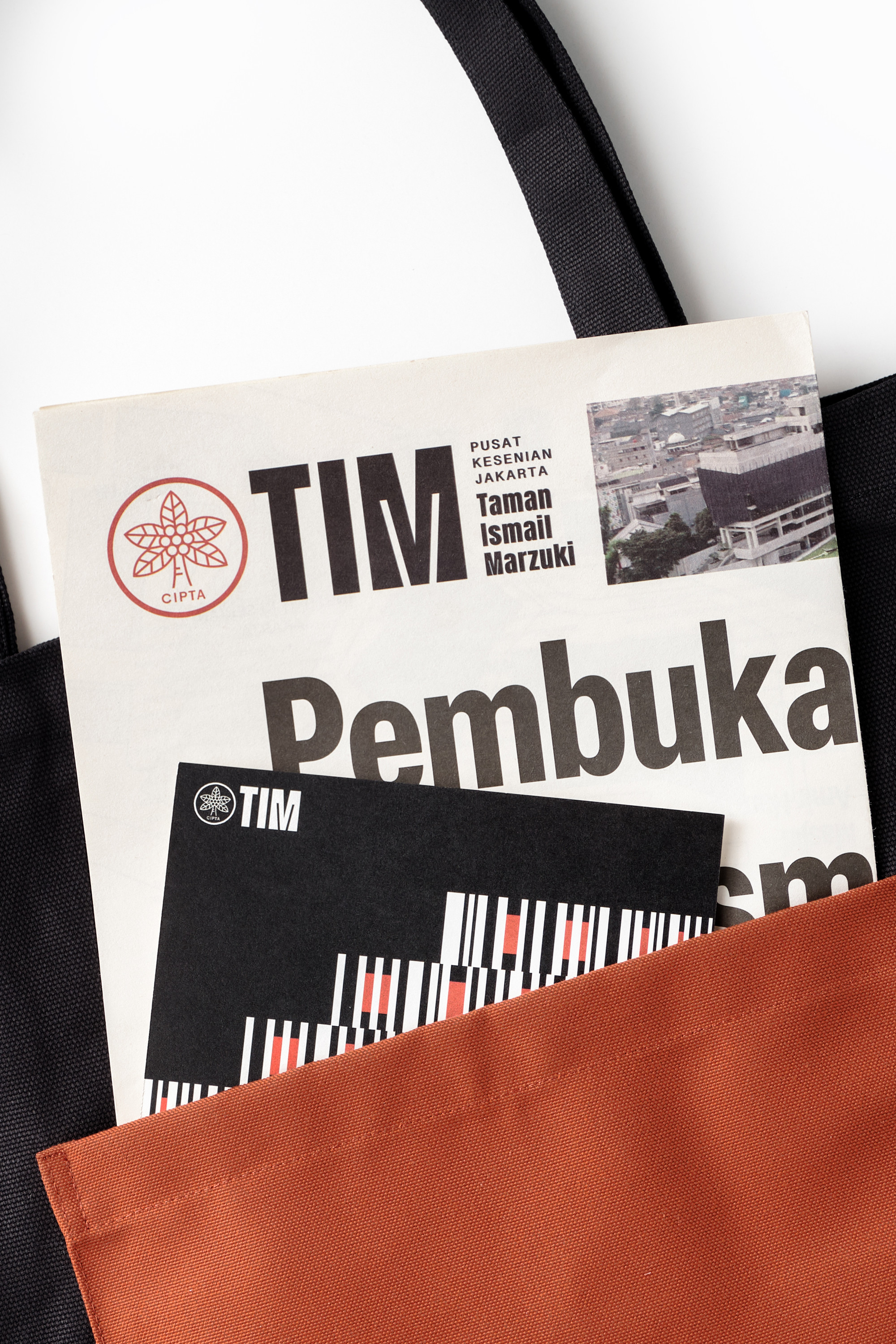
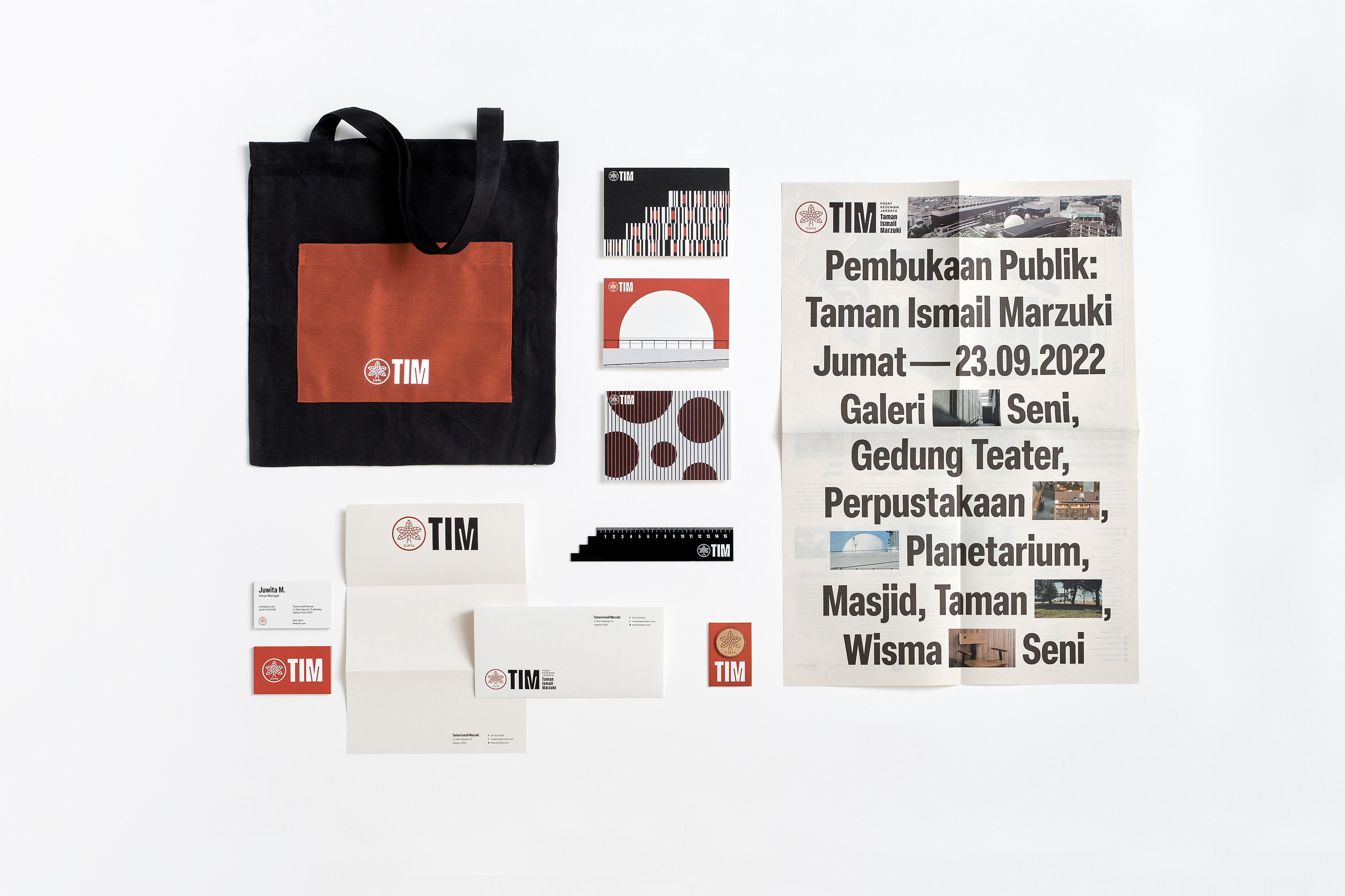
Taman Ismail Marzuki, commonly known as TIM, is an art and cultural center that has been the epicenter of Indonesian art movements for decades. Along with the recent revitalization in 2022 comes the quest for a new brand identity. The goal is to contemporize TIM, aligning it with today's context while preserving its historical roots. TIM's identity started with the Cipta logo. It was crafted by Oesman Effendi, a painter and lecturer at the Jakarta Institute of Arts. Though no dependable sources explain the meaning behind the logo, the visualization of the coconut tree might have taken inspiration from Ismail Marzuki's song, Rayuan Pulau Kelapa.

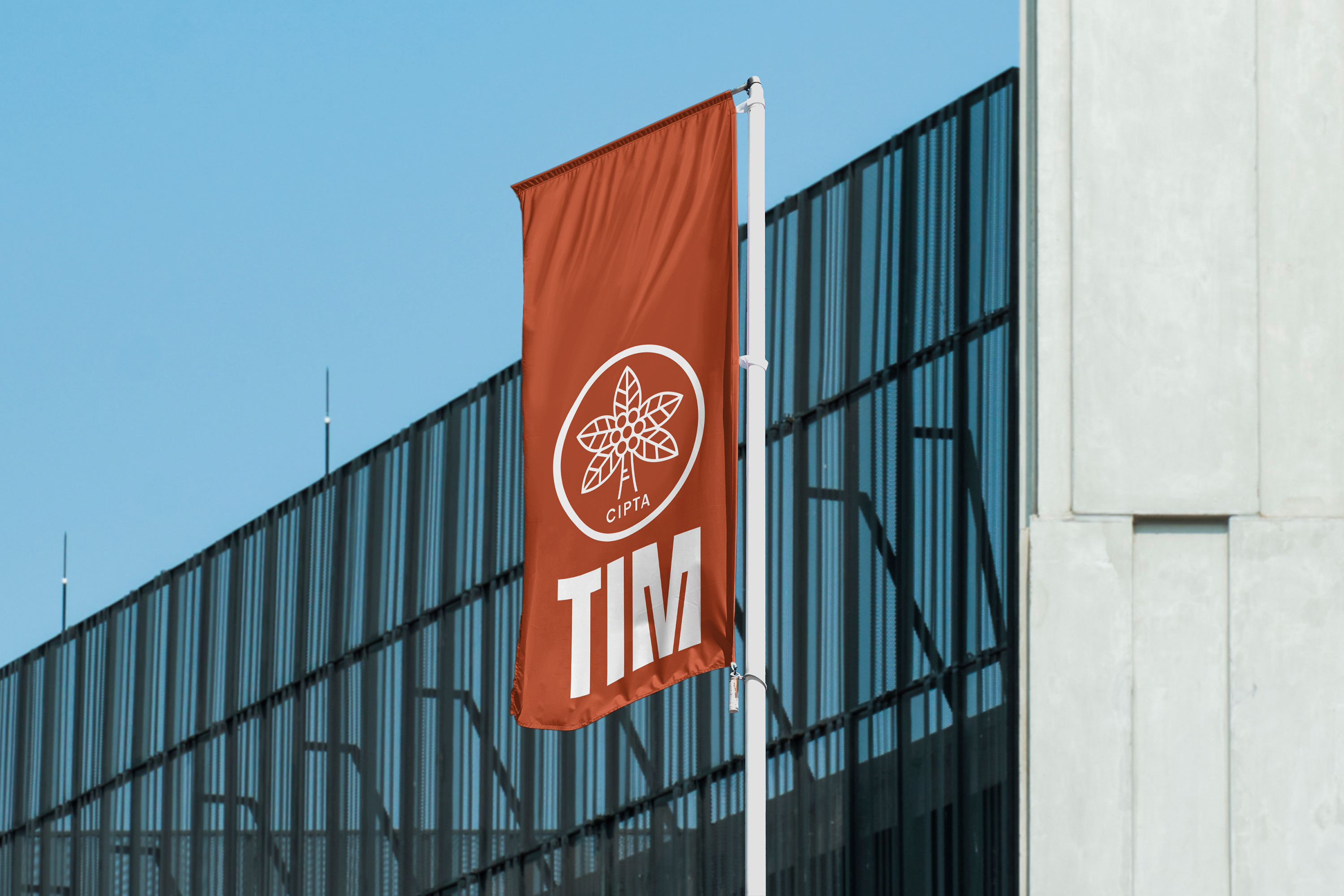
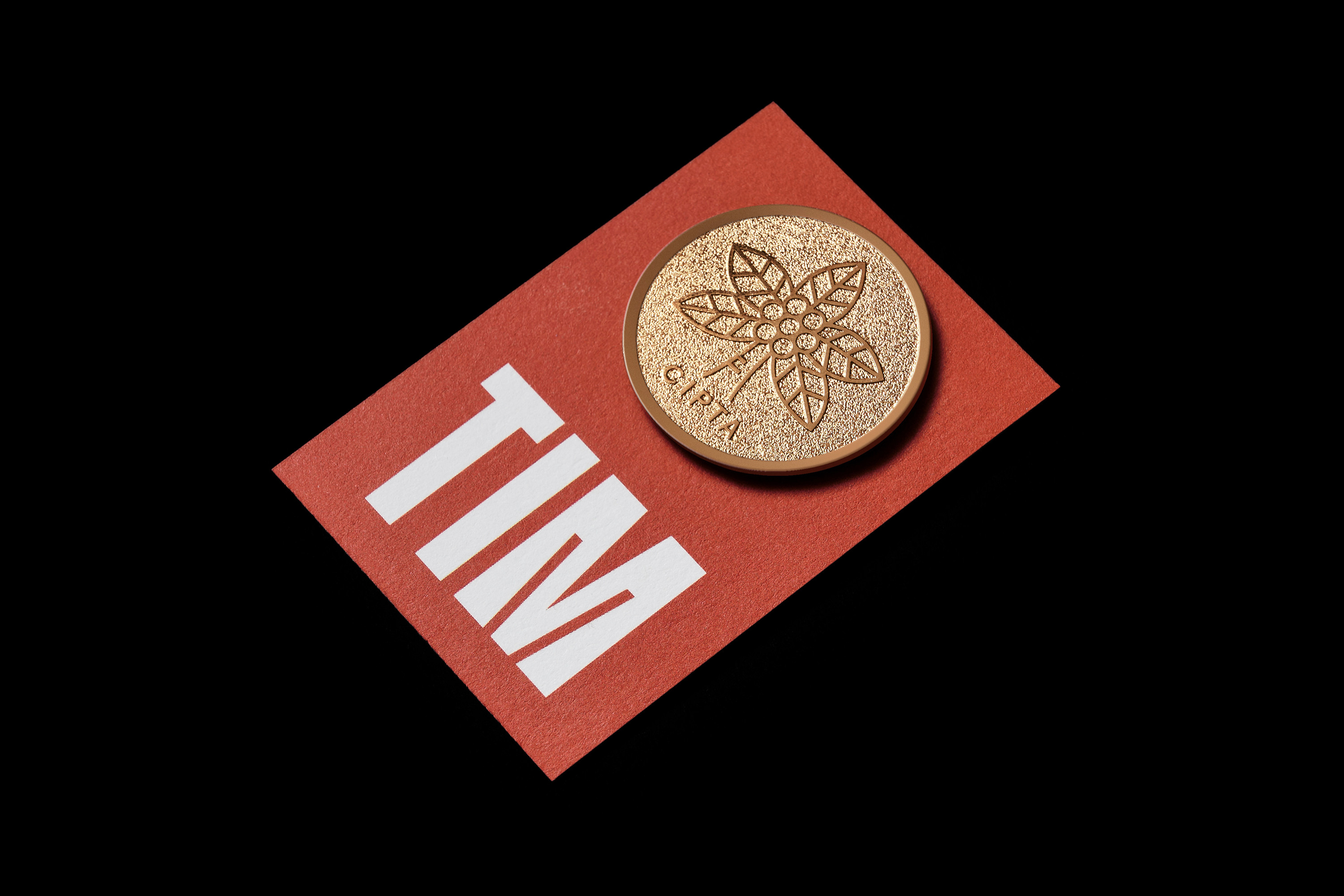
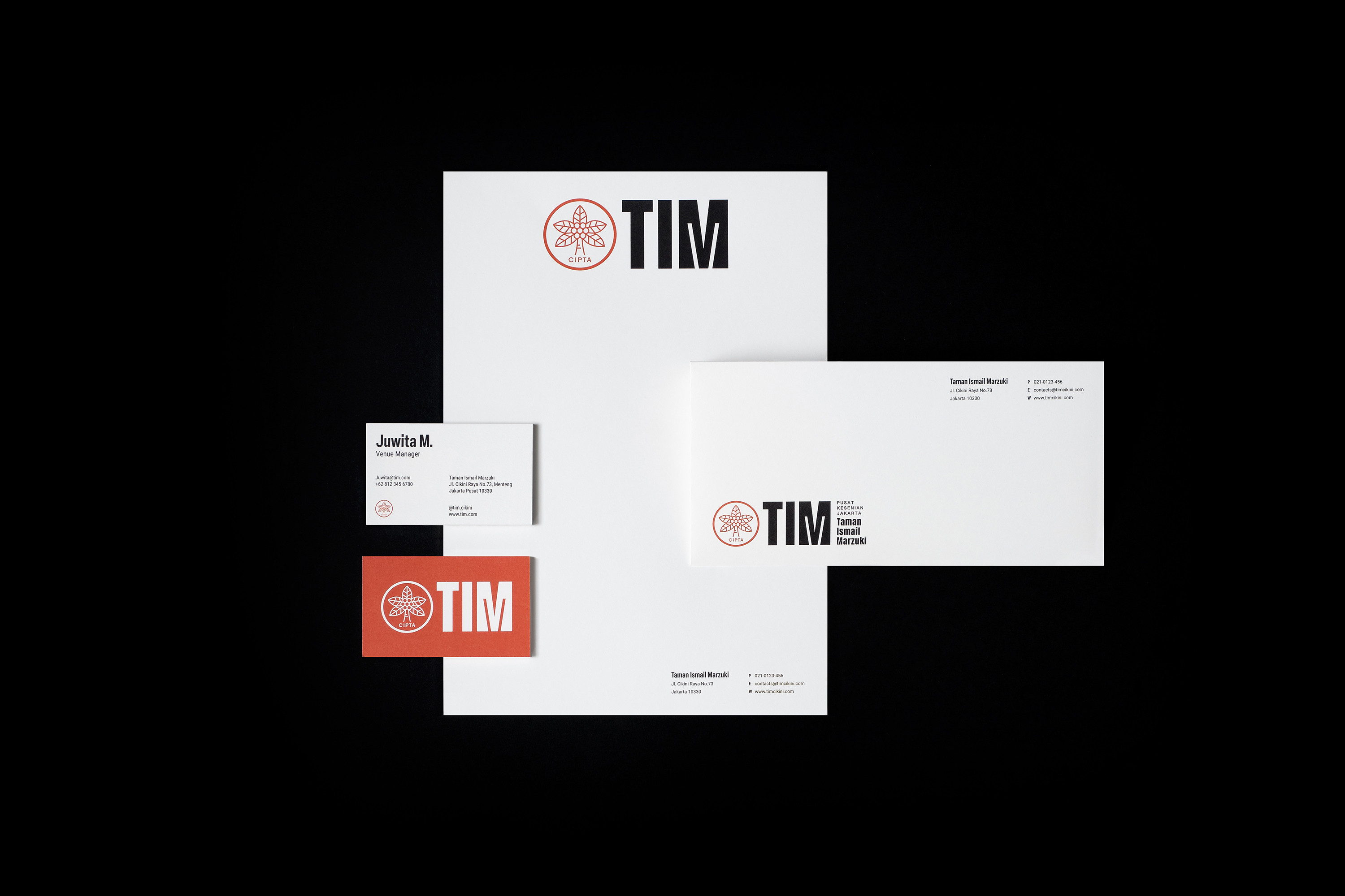
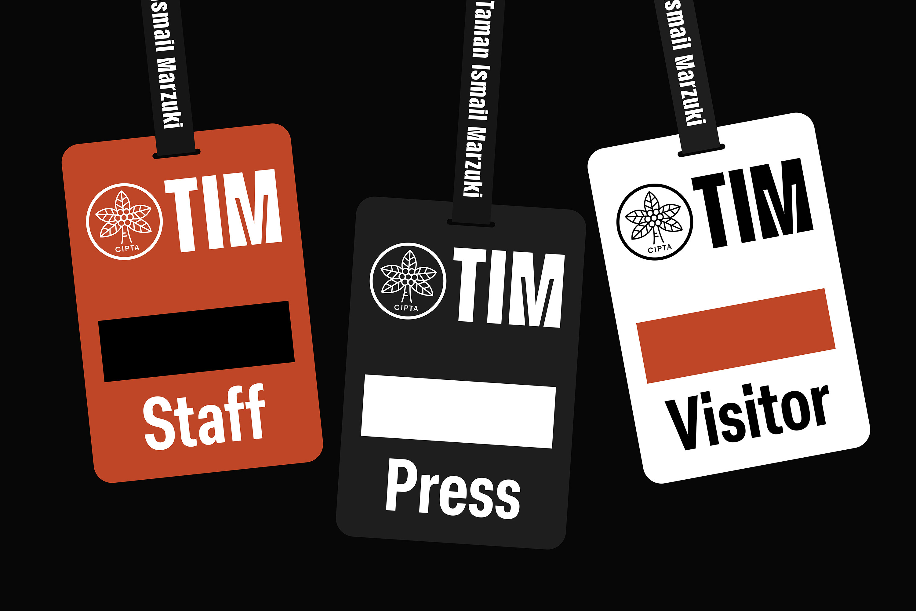
The challenge was to change the logo without overtly signaling a change. As a well-established art center with a rich history, preserving historical values is paramount. Thoughtlessly modifying the logo would be unwise, as the goal is not to rewrite the past but to guide it in embracing the present. By retaining elements that hold symbolic significance for the logo, it maintains familiarity while enhancing functionality across different mediums.


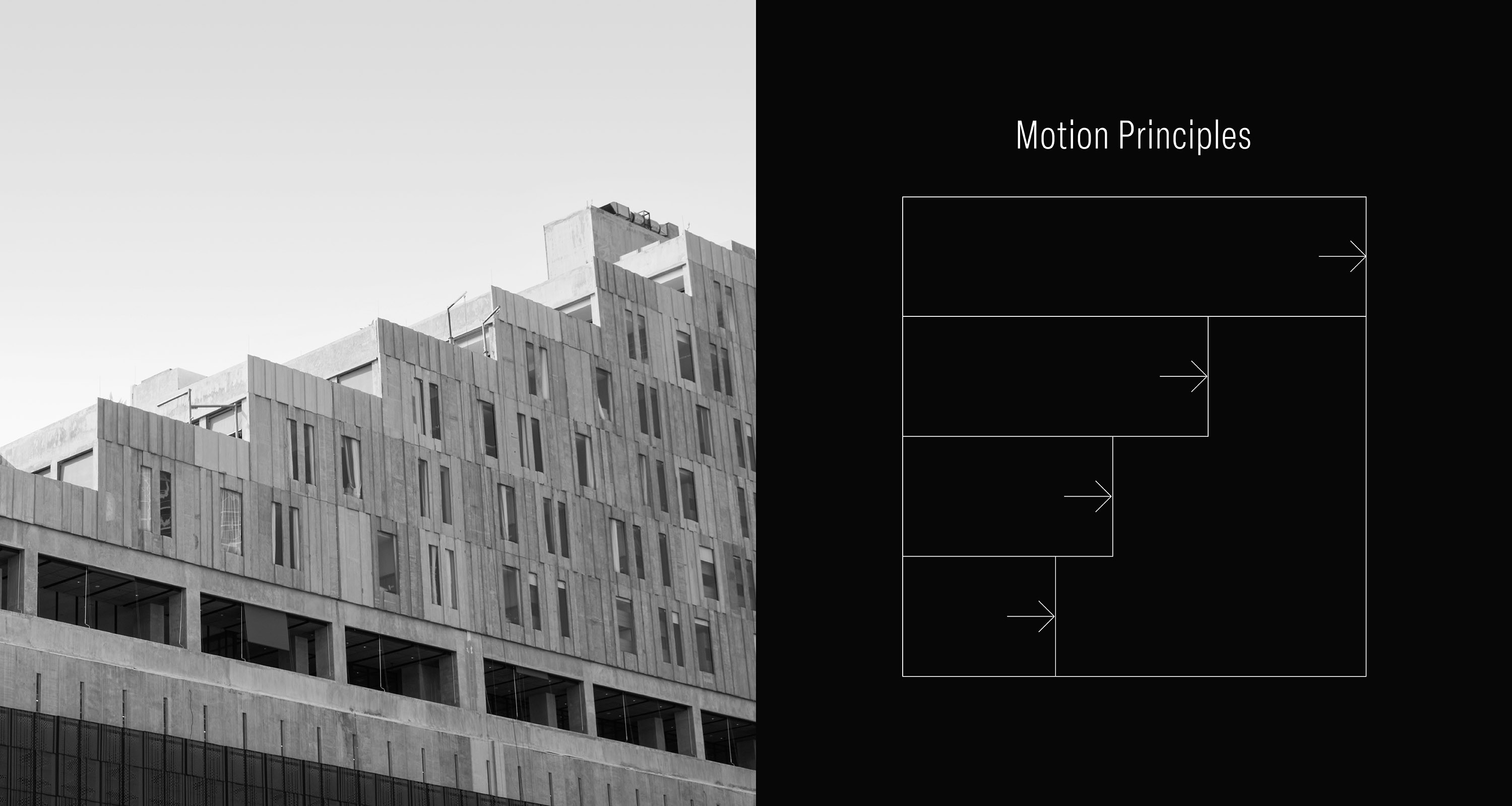
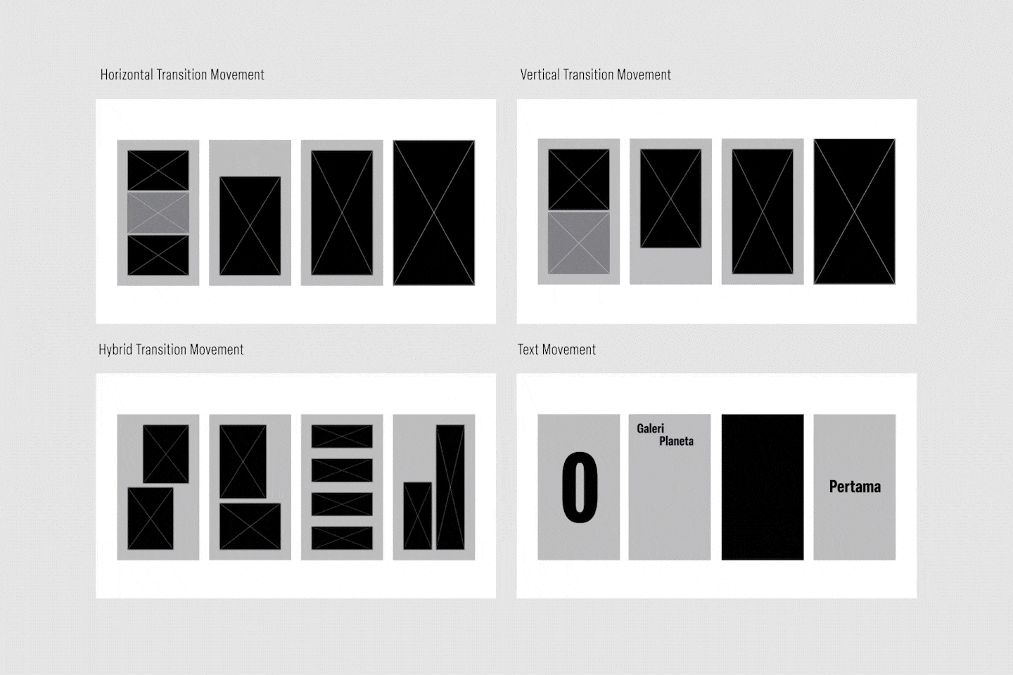
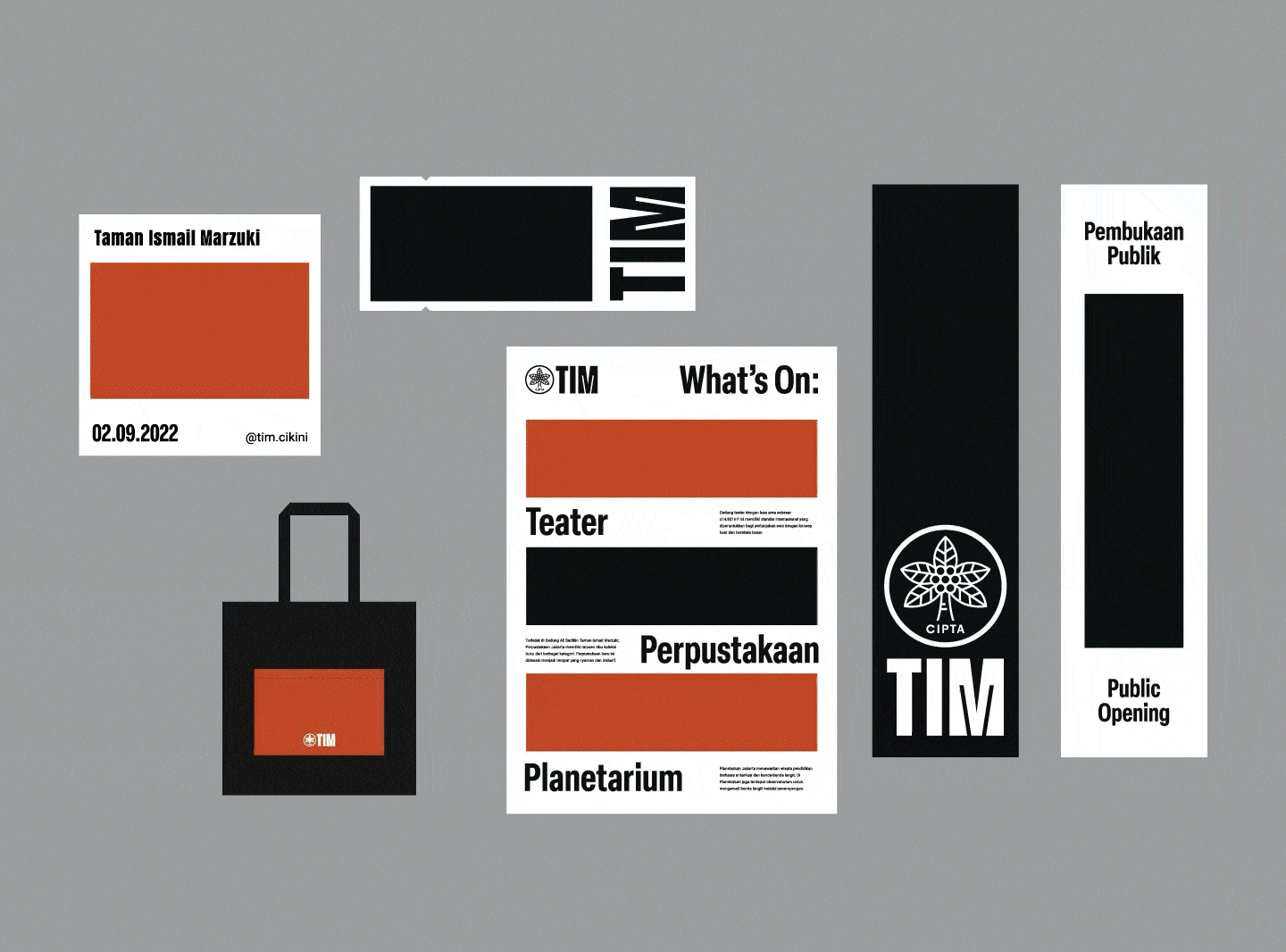
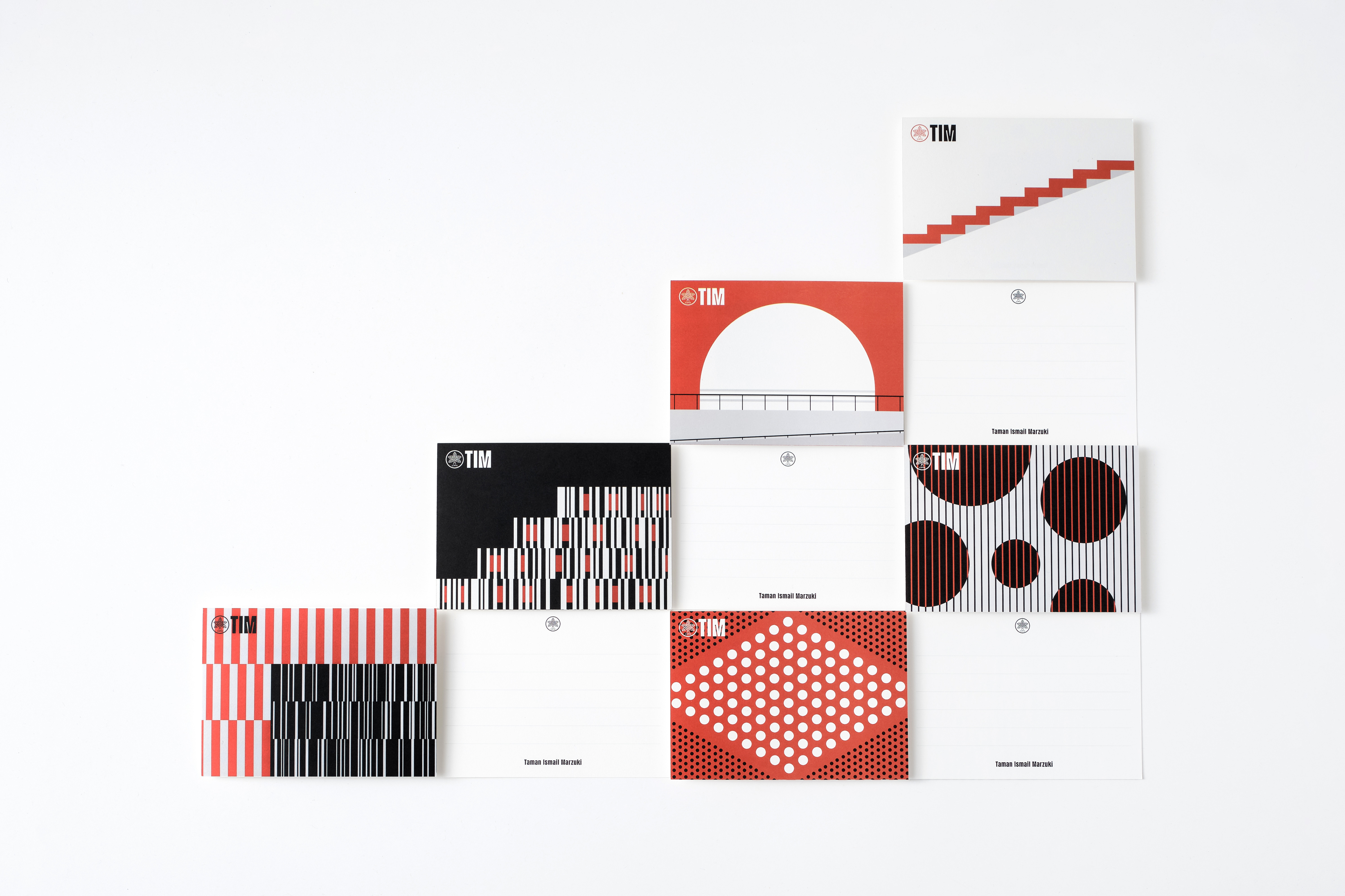
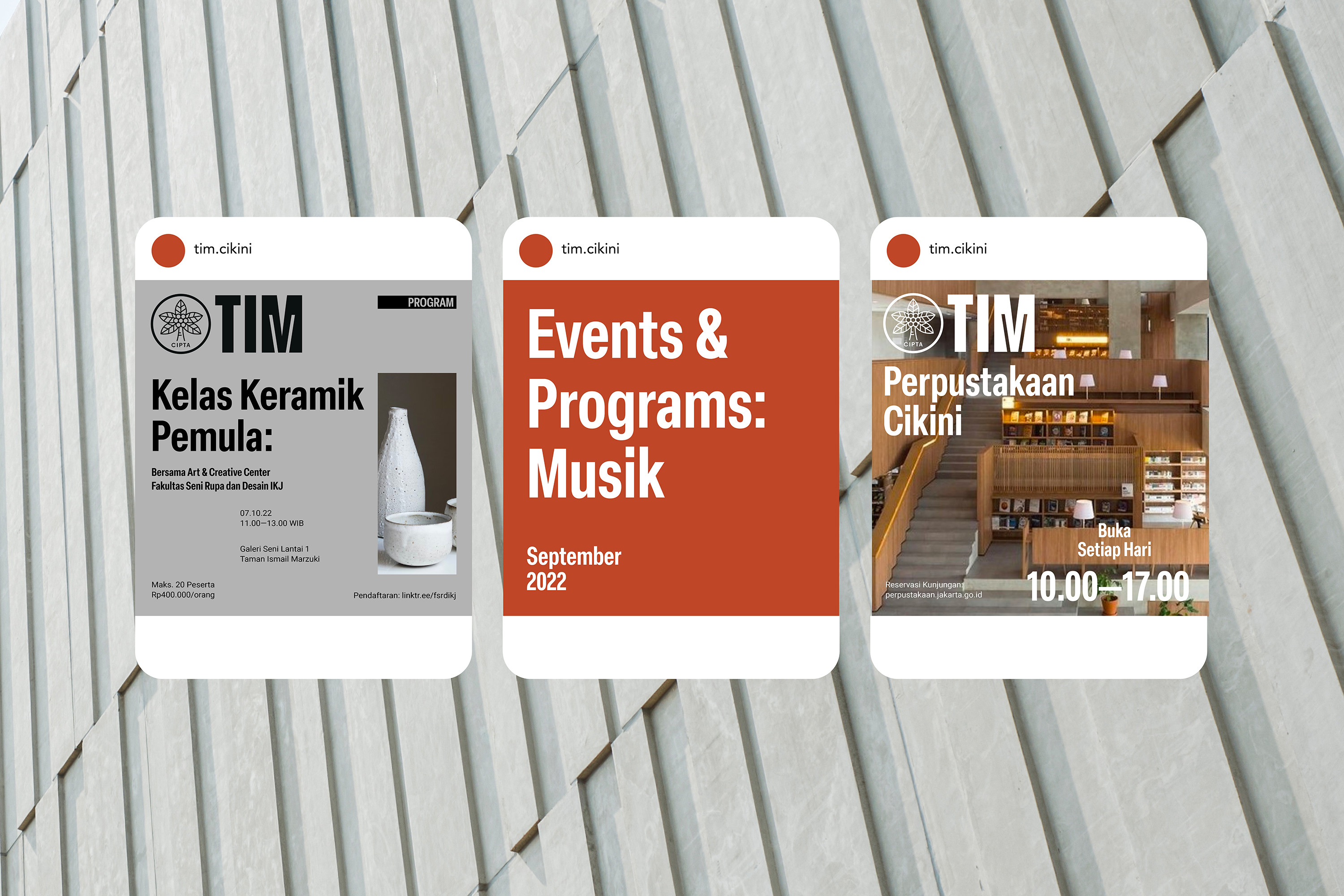
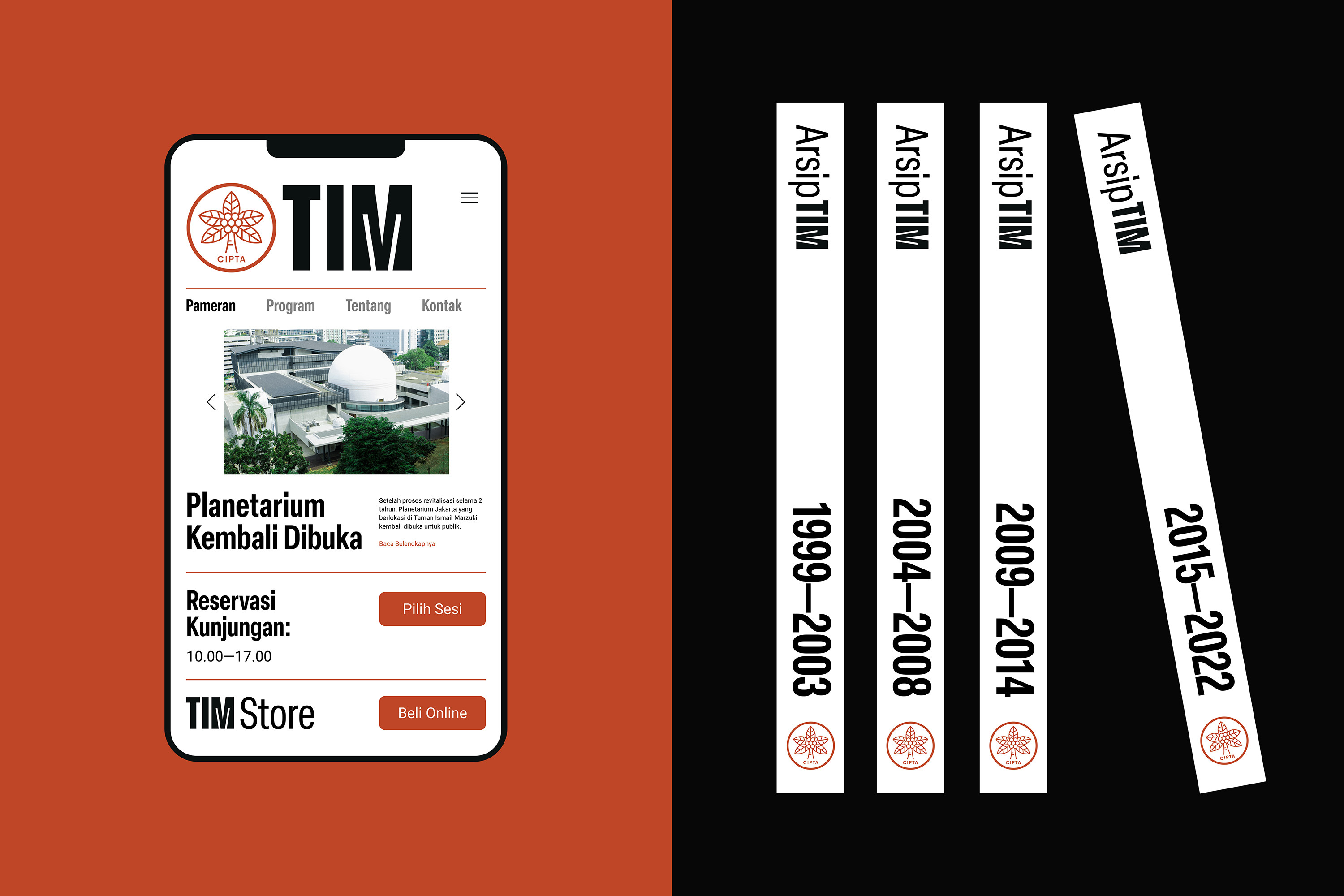
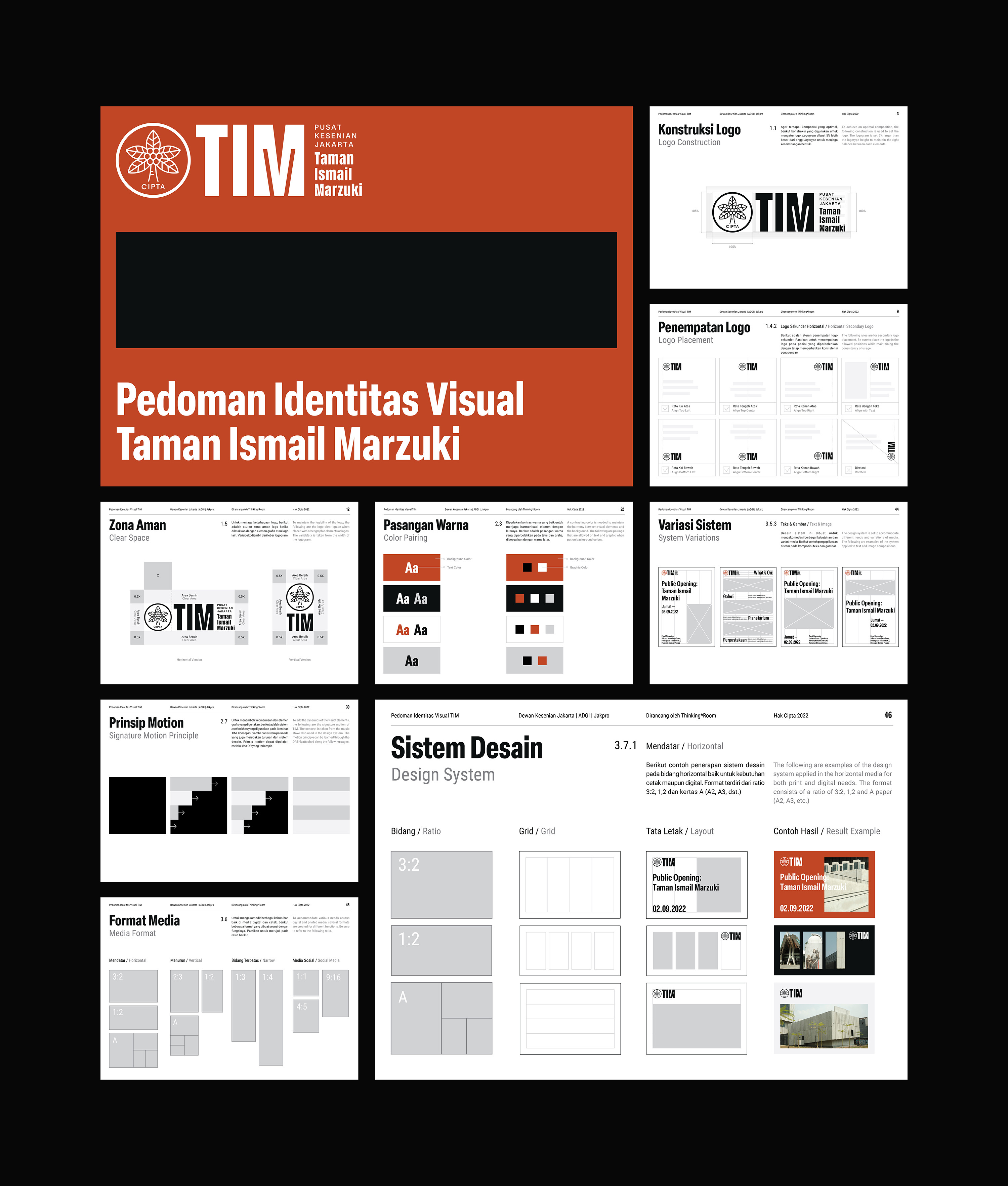
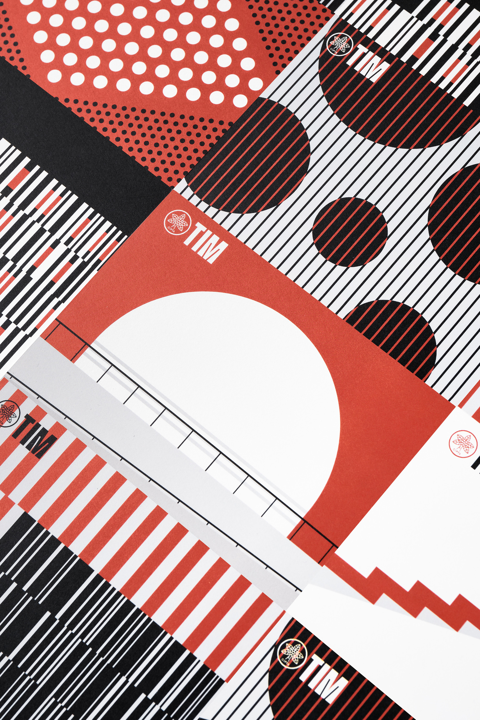
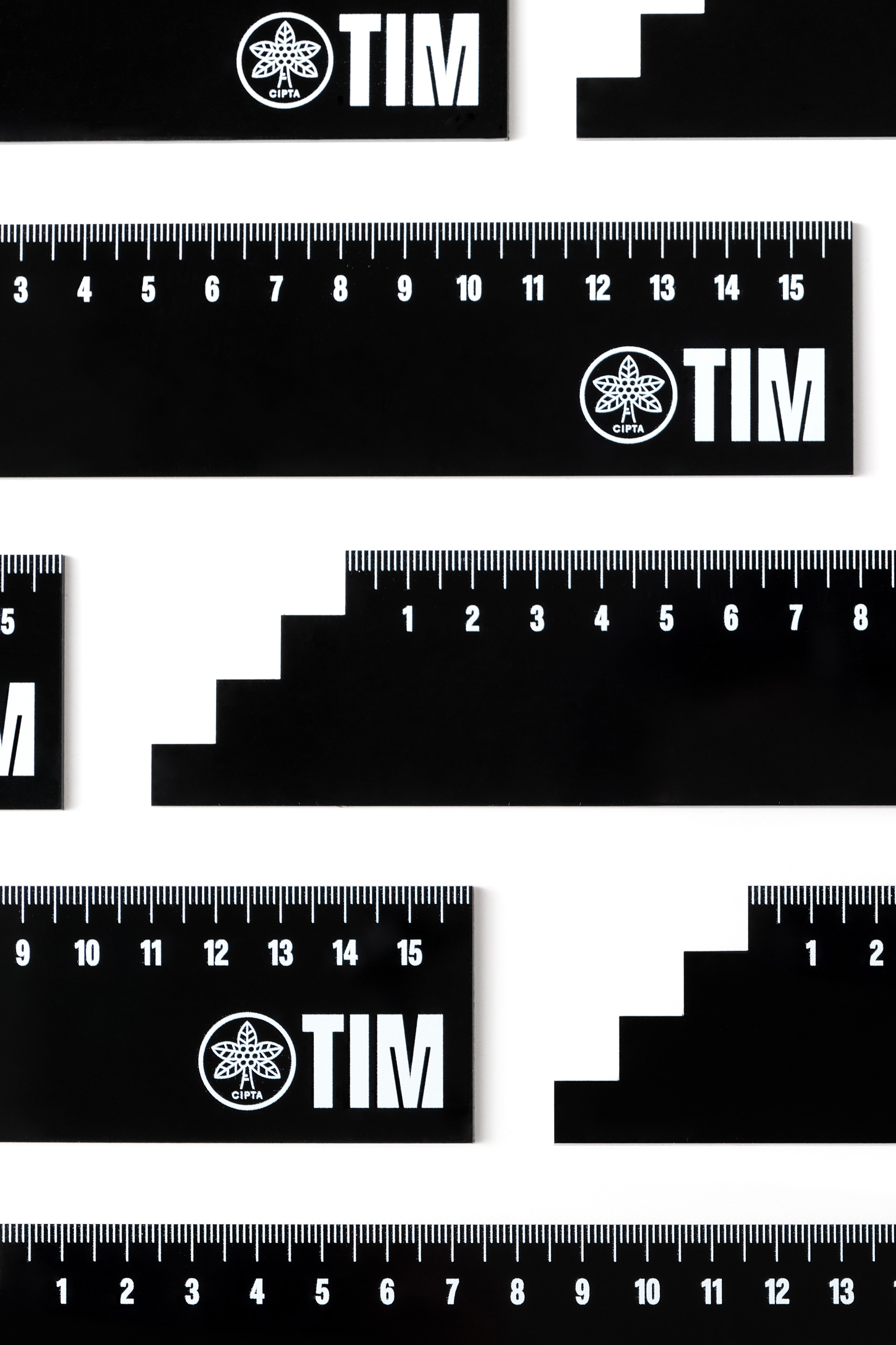
TIM adopted the musical scale as its architectural concept. We embrace and leverage it as the foundation for the graphic design system. From motion design to layout & grid system, the concept seamlessly integrates, creating a holistic visual identity.

Our website's landscape mode is best viewed in desktop & tablet, not mobile. Rotate it back for mobile viewing.
*Image courtesy of Microsoft. All rights reserved